As well as giving users the option to define their own colours (whether hex-codes like "#FF6347" or built-in R colours like "tomato"), openair provides a great number of curated pre-defined colour schemes for users to take advantage of.
An easy way to access all of the available schemes is by running the openSchemes() function, which returns a table of available palettes.
# A tibble: 6 × 3
  palette   type       max_n
  <chr>     <chr>      <dbl>
1 default   sequential    NA
2 hue       sequential    NA
3 greyscale sequential    NA
4 increment sequential    NA
5 heat      sequential    NA
6 jet       sequential    NA
There are currently 104 schemes available through openair. You can simply feed any of these schemes into the cols argument of your plot of choice and they will automatically be applied.
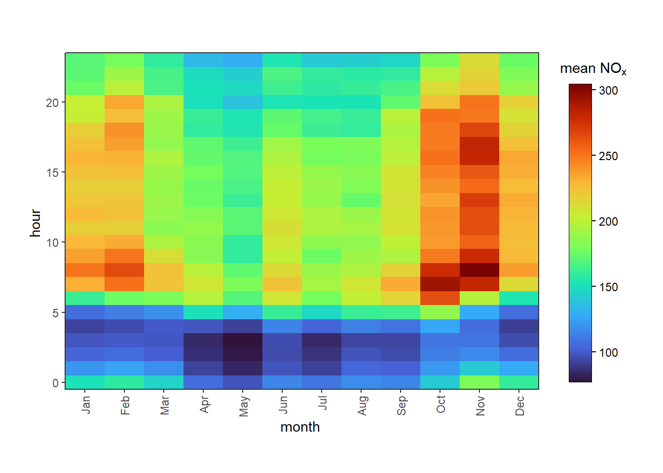
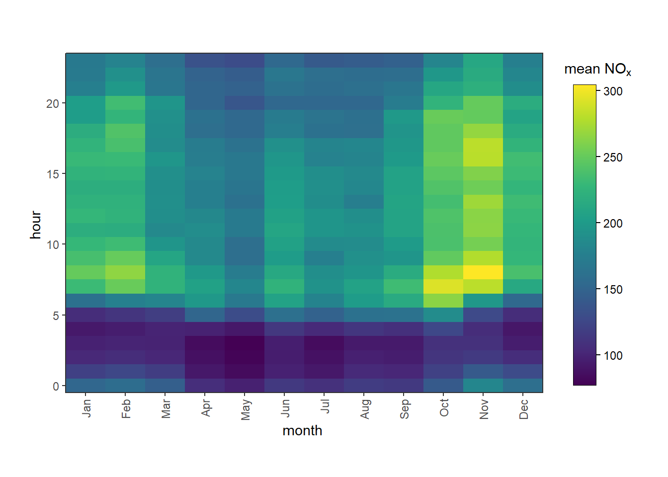
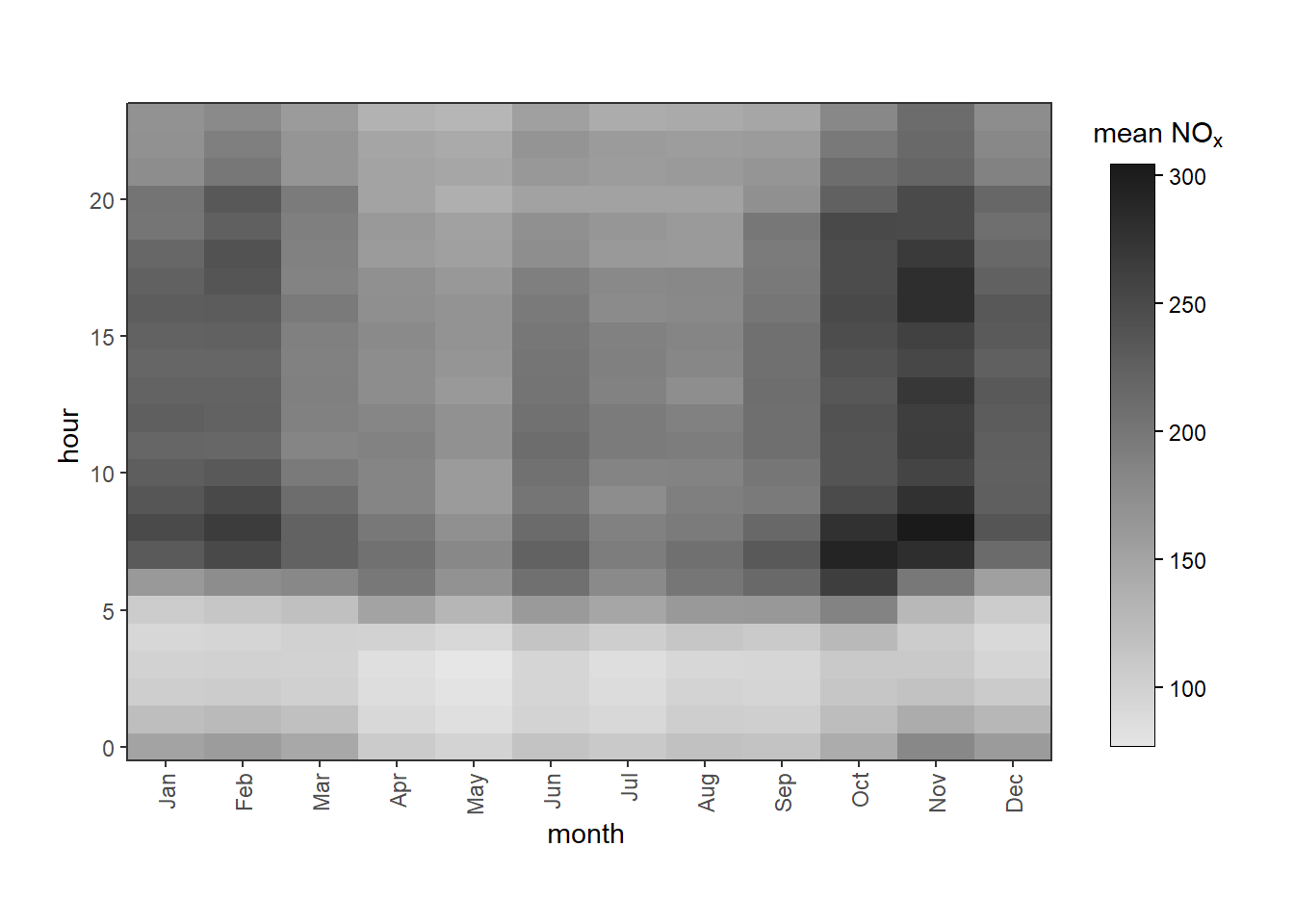
Figure B.1: Examples of different colour schemes applied to the same plot.
There are three kinds of scheme:
"sequential" palettes can be interpolated into any number of individual colours. These are most useful for numeric data (e.g., the colourbar of a polarPlot()) or categorical data with some kind of natural order (e.g., “low”, “medium”, “high”).
"diverging" palettes are similar to sequential palettes, but have a natural middle point (usually white or black) from which two separate sequential schemes diverge. These are useful for functions like corPlot() and polarDiff().
"qualitative" palettes are typically limited to a certain number of colours, and are typically visually distinct from one another. These are most useful for unordered categorical data (e.g., distinguishing between measured and modelled data, different monitoring sites, etc.).
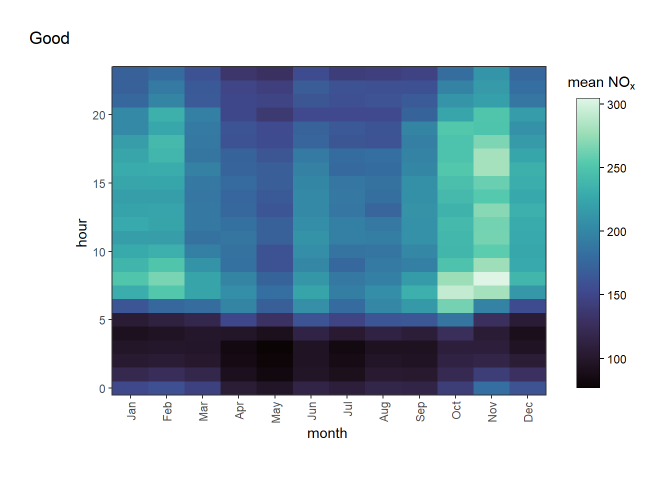
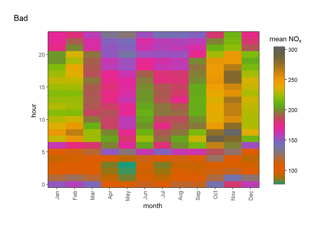
openair does not enforce that you use the “correct” kind of palette with the correct kind of plot and, for certain qualitative palettes, will actually attempt to interpolate them for you. This can make some horrible looking plots if misused, as in Figure B.2.
trendLevel(mydata, cols ="mako", tag ="Good")trendLevel(mydata, cols ="Dark2", tag ="Bad")
(a) mako sequential colour scheme
(b) Dark2 qualitative colour scheme
Figure B.2: Examples of ‘correct’ and ‘incorrect’ use of colour schemes. The left-hand plot uses a sequential scheme, which is appropriate for the numeric data being plotted. The right-hand plot uses a qualitative scheme, which is less appropriate for this kind of data.
To better control colours, you can use the colourOpts() function instead of a bare scheme name. This allows you to control extra features of the plot:
direction allows you to reverse the palette. For example, "viridis" progresses from dark purple at low values to yellow at higher values. direction = -1 changes this to have yellow at lower values and dark purple at higher values.
begin and end allow you to select a subset of the palette. For example, begin = 0.25 and end = 0.75 would select the middle 50% of the palette, which can be useful for avoiding very light or very dark colours.
alpha allows you to control the transparency of the colours. This may be useful to combat over-plotting on a particularly busy scatterPlot(), or many be of help if you want to, e.g., overlay plots on a map for an infographic or poster.
saturation allows you to control the saturation of the colours. Saturation refers to the intensity of the colours, with higher saturation resulting in more vivid colours and lower saturation resulting in more muted colours. saturation defaults to 0.5, with 0 being completely grey and 1 being super-saturated.
lightness allows you to control the lightness of the colours. Lightness refers to how light or dark the colours are, with higher lightness resulting in lighter colours and lower lightness resulting in darker colours. lightness defaults to 0.5, with 0 being completely black and 1 being completely white.
(b) The turbo colour scheme with begin = 0.2 and end = 0.8 to subset the palette
(c) The turbo colour scheme with direction = -1 to reverse the palette
(d) The turbo colour scheme with saturation = 0.25 to reduce saturation
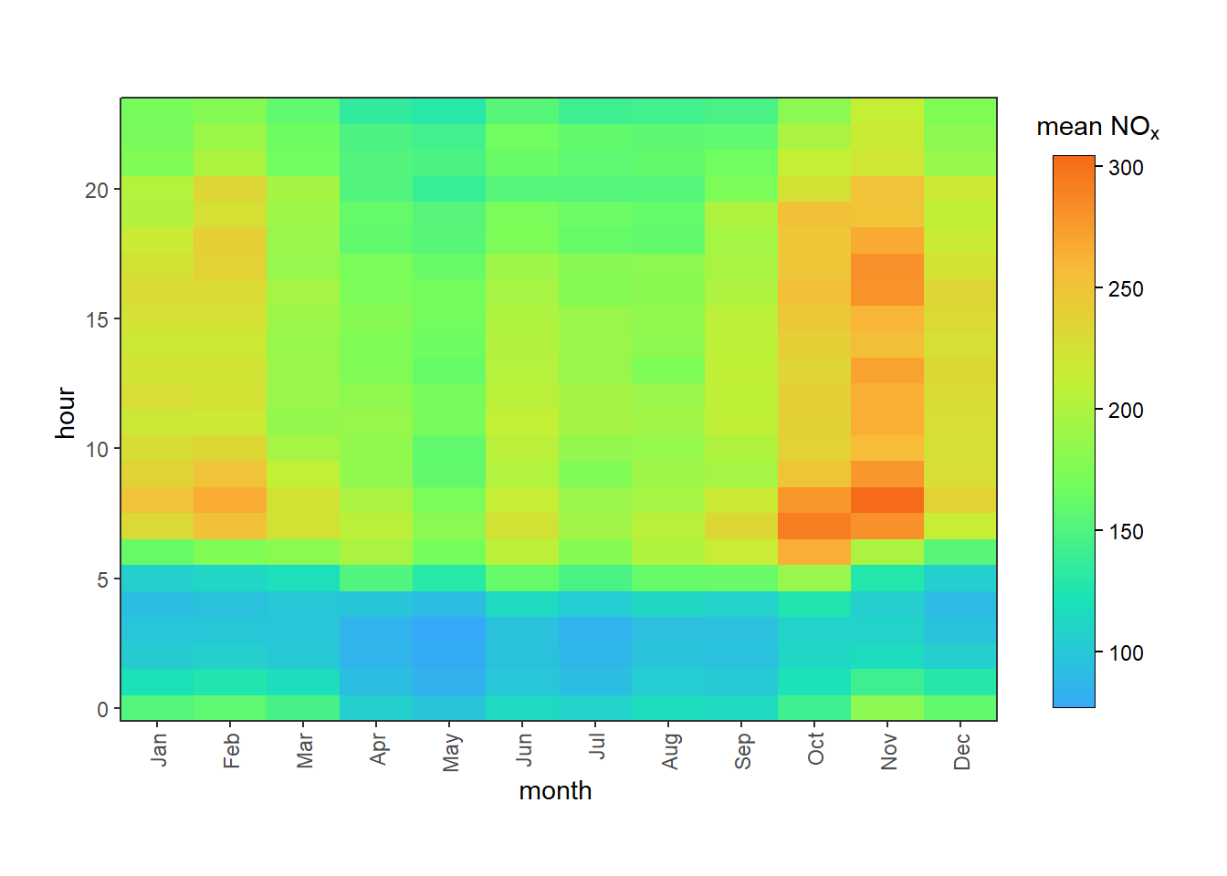
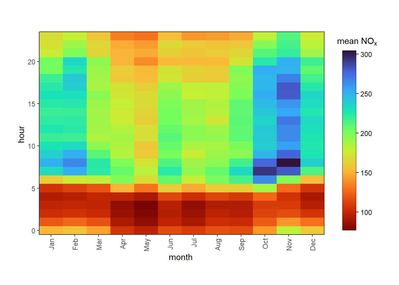
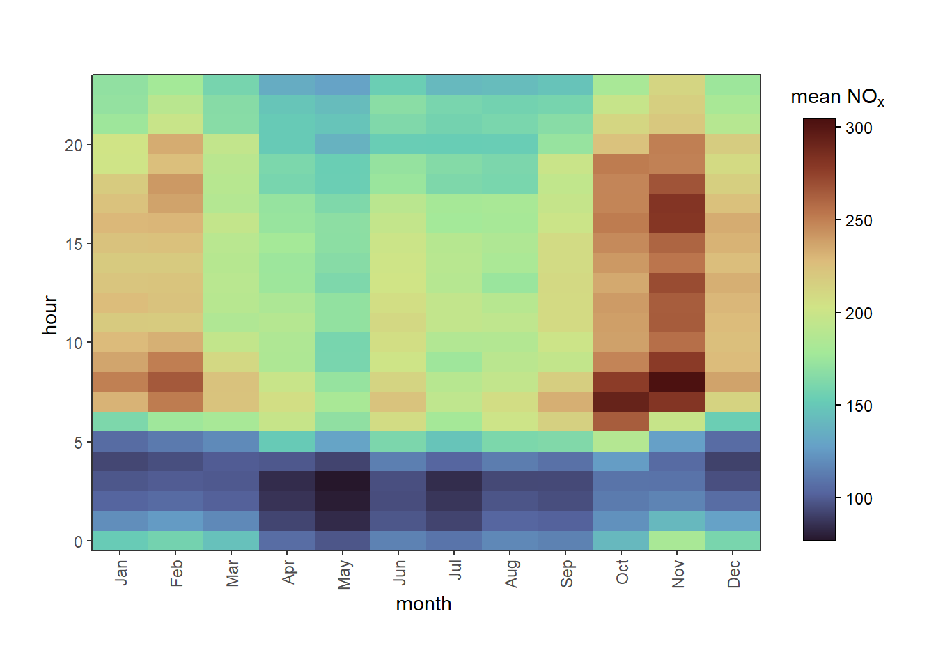
Figure B.3: Examples of using colourOpts() to control the colour scheme.
B.2 Choosing a Colour Palette
Please remember that choosing colours is more than an aesthetic preference!
Many people are colour-blind, so have trouble distinguishing between certain colours. Most commonly red-green colour-blindness is discussed, but there are many different types. Similarly, some people without colour vision deficiency may choose to print your plots in black and white.
Modern web accessibility guidelines demand certain levels of colour contrast for accessibility purposes.
Colour has cultural meaning that should be obeyed to make your plots understandable - for example, green is often interpreted as ‘good’ or ‘safe’ whereas red means ‘bad’ or ‘danger’ (as used in the UK Daily Air Quality Index). Using green for high concentrations and red for low concentrations may therefore confuse a reader! Equally, it makes sense to use warm colours like orange to represent summer and cool colours like blue to represent winter - the reverse would be unusual and could cause confusion.
‘Rainbow’ palettes (e.g., "jet") are linked to lower accuracy in certain applications as they are not ‘perceptually uniform’ - often they create artificial ‘bands’ of colour which accentuate certain features despite the scale being smoothly varying. If you do wish to use a rainbow palette, we recommend "turbo" - read more about it here.
It’s often useful to be consistent within your reports, papers, posters and slide decks. For example, if Site A is blue and Site B is orange in your timePlot() but they’re reversed in your timeVariation() plot, that will cause confusion for any readers comparing the two figures.
Sometimes a continuous palette is better for categorical data than a categorical one if the categories have some kind of order. For example, even though the breaks argument in trendLevel() produces discrete categories, they are still ordered from the lowest value bin to a higher value one, so "viridis" still makes more sense than "Dark2". However, if the categories were different measurement sites, for example, using a continuous palette may imply order where there isn’t any - in that case, "Dark2" is the more suitable choice.
It is the user’s responsibility to choose an accessible and appropriate palette for their plots. Some of the palettes built-in to openair have been designed to be accessible. For categorical data, consider one of Paul Tol’s palettes (e.g., "tol.bright") which are distinct for all people, from black and white, on screen and paper, and match well together aesthetically. For continuous data, Fabio Crameri’s palettes (e.g., "batlow") are designed to be perceptually uniform and ordered, colour deficiency friendly, and readable in black and white print. Also popular are the “Brewer” palettes (e.g., "Dark2") and the “viridis” palettes (e.g., "viridis", "mako", etc.). While these palettes are designed for accessibility, using arguments like begin, end, lightness and saturation may make them less so, so tread carefully!
B.3 Gallery
An application has been developed to preview all of the colour schemes available in openair. This has been stored in a GitHub gist (some code that can be shared publicly). Copy the code below and paste it into R, which will load the necessary needed to launch this application. Note that the below chunk potentially installs or updates three new packages.
# install the required packages, if not already installedinstall.packages(c("devtools", "shiny", "bslib"))# get the code from the gistdevtools::source_gist("https://gist.github.com/jack-davison/909433ca28fee378cfe0482a7b719527", filename ="preview_openair_schemes.R")# launch in browserpreview_openair_schemes(options =list(launch.browser =T))
As an alternative, this section includes a gallery of the different colour schemes available in openair, grouped by type.