Plot time series, perhaps for multiple pollutants, grouped or in separate panels.
Source:R/timePlot.R
timePlot.RdThe timePlot() is the basic time series plotting function in openair. Its
purpose is to make it quick and easy to plot time series for pollutants and
other variables. The other purpose is to plot potentially many variables
together in as compact a way as possible.
Usage
timePlot(
  mydata,
  pollutant = "nox",
  group = FALSE,
  stack = FALSE,
  normalise = NULL,
  avg.time = "default",
  data.thresh = 0,
  statistic = "mean",
  percentile = NA,
  date.pad = FALSE,
  type = "default",
  cols = "brewer1",
  theme = "default",
  log = FALSE,
  windflow = NULL,
  smooth = FALSE,
  smooth_k = NULL,
  ci = TRUE,
  ref.x = NULL,
  ref.y = NULL,
  key.columns = NULL,
  key.position = "bottom",
  key.title = NULL,
  name.pol = pollutant,
  date.breaks = 7,
  date.format = NULL,
  auto.text = TRUE,
  plot = TRUE,
  key = NULL,
  ...
)
Arguments
- mydata
A data frame of time series. Must include a
datefield and at least one variable to plot.- pollutant
Name of variable to plot. Two or more pollutants can be plotted, in which case a form like
pollutant = c("nox", "co")should be used.- group
Controls how multiple lines/series are grouped. Three options are available:
FALSE(default): each pollutant is plotted in its own panel with its own scale.TRUE: all pollutants are plotted together on the same panel and scale, coloured by pollutant name.A character string giving the name of a column in
mydata(e.g.group = "site"orgroup = "pollutant"): lines are coloured by the values in that column. With a singlepollutantall groups appear in one panel; with multiplepollutants each pollutant gets its own panel and lines within each panel are coloured by the group column. This is particularly useful for long-format data where multiple species are stored in one column.
- stack
If
TRUEthe time series will be stacked by year. This option can be useful if there are several years worth of data making it difficult to see much detail when plotted on a single plot.- normalise
Should variables be normalised? The default is is not to normalise the data.
normalisecan take two values, either"mean"or a string representing a date in UK format e.g. "1/1/1998" (in the format dd/mm/YYYY). Ifnormalise = "mean"then each time series is divided by its mean value. If a date is chosen, then values at that date are set to 100 and the rest of the data scaled accordingly. Choosing a date (say at the beginning of a time series) is very useful for showing how trends diverge over time. Settinggroup = TRUEis often useful too to show all time series together in one panel.- avg.time
This defines the time period to average to. Can be
"sec","min","hour","day","DSTday","week","month","quarter"or"year". For much increased flexibility a number can precede these options followed by a space. For example, an average of 2 months would beavg.time = "2 month". In addition,avg.timecan equal"season", in which case 3-month seasonal values are calculated with spring defined as March, April, May and so on.Period boundary behaviour: how bin boundaries are determined depends on the type of period:
Single-unit periods (
"hour","day","week", etc.) are floored to the start of the enclosing unit in the data's timezone (e.g."day"floors to midnight).Multi-unit fixed-length periods (
"3 day","6 hour","2 week", etc.) use epoch-aligned arithmetic: bin boundaries are fixed multiples of the period length counted from 1970-01-01, so the same calendar dates always fall in the same bin regardless of where the data starts, and bins run continuously across month boundaries without resetting at the start of each month. For example, withavg.time = "3 day"a bin that begins on 29 January will end on 31 January, and the next bin begins on 1 February — the month boundary does not start a new bin.Calendar periods (
"month","quarter","year") are floored to the start of the enclosing calendar unit, so they correctly respect variable month and year lengths.
Note that
avg.timecan be less than the time interval of the original series, in which case the series is expanded to the new time interval. This is useful, for example, for calculating a 15-minute time series from an hourly one where an hourly value is repeated for each new 15-minute period. Note that when expanding data in this way it is necessary to ensure that the time interval of the original series is an exact multiple ofavg.timee.g. hour to 10 minutes, day to hour. Also, the input time series must have consistent time gaps between successive intervals so thattimeAverage()can work out how much 'padding' to apply. To pad-out data in this way choosefill = TRUE.- data.thresh
The data capture threshold to use (%). A value of zero means that all available data will be used in a particular period regardless if of the number of values available. Conversely, a value of 100 will mean that all data will need to be present for the average to be calculated, else it is recorded as
NA. See alsointerval,start.dateandend.dateto see whether it is advisable to set these other options.- statistic
The statistic to apply when aggregating the data; default is the mean. Can be one of
"mean","max","min","median","frequency","sum","sd","percentile". Note that"sd"is the standard deviation,"frequency"is the number (frequency) of valid records in the period and"data.cap"is the percentage data capture."percentile"is the percentile level (%) between 0-100, which can be set using the"percentile"option — see below. Not used ifavg.time = "default".- percentile
The percentile level in percent used when
statistic = "percentile"and when aggregating the data withavg.time. More than one percentile level is allowed fortype = "default"e.g.percentile = c(50, 95). Not used ifavg.time = "default".- date.pad
Should missing data be padded-out? This is useful where a data frame consists of two or more "chunks" of data with time gaps between them. By setting
date.pad = TRUEthe time gaps between the chunks are shown properly, rather than with a line connecting each chunk. For irregular data, set toFALSE. Note, this should not be set fortypeother thandefault.- type
Character string(s) defining how data should be split/conditioned before plotting.
"default"produces a single panel using the entire dataset. Any other options will split the plot into different panels - a roughly square grid of panels if onetypeis given, or a 2D matrix of panels if twotypesare given.typeis always passed tocutData(), and can therefore be any of:A built-in type defined in
cutData()(e.g.,"season","year","weekday", etc.). For example,type = "season"will split the plot into four panels, one for each season.The name of a numeric column in
mydata, which will be split inton.levelsquantiles (defaulting to 4).The name of a character or factor column in
mydata, which will be used as-is. Commonly this could be a variable like"site"to ensure data from different monitoring sites are handled and presented separately. It could equally be any arbitrary column created by the user (e.g., whether a nearby possible pollutant source is active or not).
Most
openairplotting functions can take twotypearguments. If two are given, the first is used for the columns and the second for the rows.- cols
Colours to use for plotting. Can be a pre-set palette (e.g.,
"turbo","viridis","tol","Dark2", etc.) or a user-defined vector of R colours (e.g.,c("yellow", "green", "blue", "black")- seecolours()for a full list) or hex-codes (e.g.,c("#30123B", "#9CF649", "#7A0403")). Alternatively, can be a list of arguments to control the colour palette more closely (e.g.,palette,direction,alpha, etc.). SeeopenColours()andcolourOpts()for more details.- theme
A string representing an overall plot theme, defaulting to
"default". This option makes sweeping changes to non-data plot features such as fonts, colours, line widths, and so on, and may also change default arguments likecolsif not set by the user. Can also take aggplot2::theme()object, which will be used to modify the"default"theme. Pre-set options include:"default", a lattice-inspired theme resembling the traditionalopenairlook, with structured panels and visible gridlines."dark", a dark-background variant of the default theme, designed for presentations and low-light viewing, using high-contrast text and colour palettes optimised for visibility against dark panels."modern", a minimalist, contemporary theme inspired by tools such as Plotly and Observable Plot, with reduced visual clutter, horizontal emphasis in gridlines, a clean legend style, and typography suited to dashboards and reports."soft", a low-contrast, 'editorial' theme with warm background tones, subtle gridlines, and gently desaturated colours, designed for reports and publication-style figures, particularly where a calmer appearance improves readability."print", a strictly greyscale theme optimised for black-and-white reproduction, with stronger structural elements such as clearer gridlines and axis definitions to ensure good contrast and readability in printed or photocopied outputs.
Please note that if a global theme is set with
ggplot2::theme_set()to anything other than the defaultggplot2::theme_grey(), the selected openair theme will not be fully applied; instead, only minimal adjustments (such as legend positioning) will be made.- log
Should the y-axis appear on a log scale? The default is
FALSE. IfTRUEa well-formatted log10 scale is used. This can be useful for plotting data for several different pollutants that exist on very different scales. It is therefore useful to uselog = TRUEtogether withgroup = TRUE.- windflow
If
TRUE, the vector-averaged wind speed and direction will be plotted using arrows. Alternatively, can be a list of arguments to control the appearance of the arrows (colour, linewidth, alpha value, etc.). SeewindflowOpts()for details.- smooth
Should a smooth line be applied to the data? The default is
FALSE.- smooth_k
An integer controlling the number of basis functions used in the GAM smooth. In a GAM,
ksets the maximum degrees of freedom for the smooth term: larger values allow more flexibility and can capture finer structure in the data, while smaller values produce smoother, less wiggly fits. The default (NULL) letsggplot2choose automatically (typicallyk = 10). Increasekif the smooth appears too rigid; decrease it to avoid over-fitting.- ci
If a smooth fit line is applied, then
cidetermines whether the 95 percent confidence intervals are shown.- ref.x
Either a single value or values representing the x axis intercepts to draw lines, or a list such as that provided by
refOpts()to customise the colour/width/type/etc. of each line. SeerefOpts()for more details.- ref.y
Either a single value or values representing the y axis intercepts to draw lines, or a list such as that provided by
refOpts()to customise the colour/width/type/etc. of each line. SeerefOpts()for more details.- key.columns
Number of columns to be used in a categorical legend. With many categories a single column can make to key too wide. The user can thus choose to use several columns by setting
key.columnsto be less than the number of categories.- key.position
Location where the legend is to be placed. Allowed arguments include
"top","right","bottom","left"and"none", the last of which removes the legend entirely.- key.title
Used to set the title of the legend. The legend title is passed to
quickText()ifauto.text = TRUE.- name.pol
This option can be used to give alternative names for the variables plotted. Instead of taking the column headings as names, the user can supply replacements. For example, if a column had the name "nox" and the user wanted a different description, then setting
name.pol = "nox before change"can be used. If more than one pollutant is plotted then usece.g.name.pol = c("nox here", "o3 there").- date.breaks
Number of major x-axis intervals to use. The function will try and choose a sensible number of dates/times as well as formatting the date/time appropriately to the range being considered. The user can override this behaviour by adjusting the value of
date.breaksup or down.- date.format
This option controls the date format on the x-axis. A sensible format is chosen by default, but the user can set
date.formatto override this. For format types seestrptime(). For example, to format the date like "Jan-2012" setdate.format = "\%b-\%Y".- auto.text
Either
TRUE(default) orFALSE. IfTRUEtitles and axis labels will automatically try and format pollutant names and units properly, e.g., by subscripting the "2" in "NO2". Passed toquickText().- plot
When
openairplots are created they are automatically printed to the active graphics device.plot = FALSEdeactivates this behaviour. This may be useful when the plot data is of more interest, or the plot is required to appear later (e.g., later in a Quarto document, or to be saved to a file).- key
Deprecated; please use
key.position. IfFALSE, setskey.positionto"none".- ...
Addition options are passed on to
cutData()fortypehandling. Some additional arguments are also available, varying somewhat in different plotting functions:title,subtitle,caption,tag,xlabandylabcontrol the plot title, subtitle, caption, tag, x-axis label and y-axis label, passed toggplot2::labs()viaquickText()ifauto.text = TRUE.xlim,ylimandlimitscontrol the limits of the x-axis, y-axis and colorbar scales.ncolandnrowset the number of columns and rows in a faceted plot.scalescan be"fixed","free_x","free_y"or"free"to control whether axes are shared across facets when usingtype. Also supported are the legacyx.relationandy.relation, which can be either"same"or"free"and get remapped toscalesautomatically.Similarly,
space,axes,axis.labels,switchandstrip.positioncan be used to customise the appearance of faceted plots. Seeggplot2::facet_wrap()andggplot2::facet_grid()for the arguments these take.fontsizeoverrides the overall font size of the plot by setting thetextargument ofggplot2::theme(). It may also be applied proportionately to anyopenairannotations (e.g., N/E/S/W labels on polar coordinate plots).Various graphical parameters are also supported:
linewidth,linetype,shape,size,border, andalpha. Not all parameters apply to all plots. These can take a single value, or a vector of multiple values - e.g.,shape = c(1, 2)- which will be recycled to the length of values needed.lineend,linejoinandlinemitretweak the appearance of line plots; seeggplot2::geom_line()for more information.In polar coordinate plots,
annotate = FALSEwill remove the N/E/S/W labels and any other annotations.
Value
an openair object
Details
The function is flexible enough to plot more than one variable at once. If
more than one variable is chosen plots it can either show all variables on
the same plot (with different line types) on the same scale, or (if group = FALSE) each variable in its own panels with its own scale.
The general preference is not to plot two variables on the same graph with
two different y-scales. It can be misleading to do so and difficult with more
than two variables. If there is in interest in plotting several variables
together that have very different scales, then it can be useful to normalise
the data first, which can be down be setting the normalise option.
The user has fine control over the choice of colours, line width and line types used. This is useful for example, to emphasise a particular variable with a specific line type/colour/width.
timePlot() works very well with selectByDate(), which is used for
selecting particular date ranges quickly and easily. See examples below.
See also
Other time series and trend functions:
TheilSen(),
calendarPlot(),
smoothTrend(),
timeProp(),
timeVariation()
Examples
# basic use, single pollutant
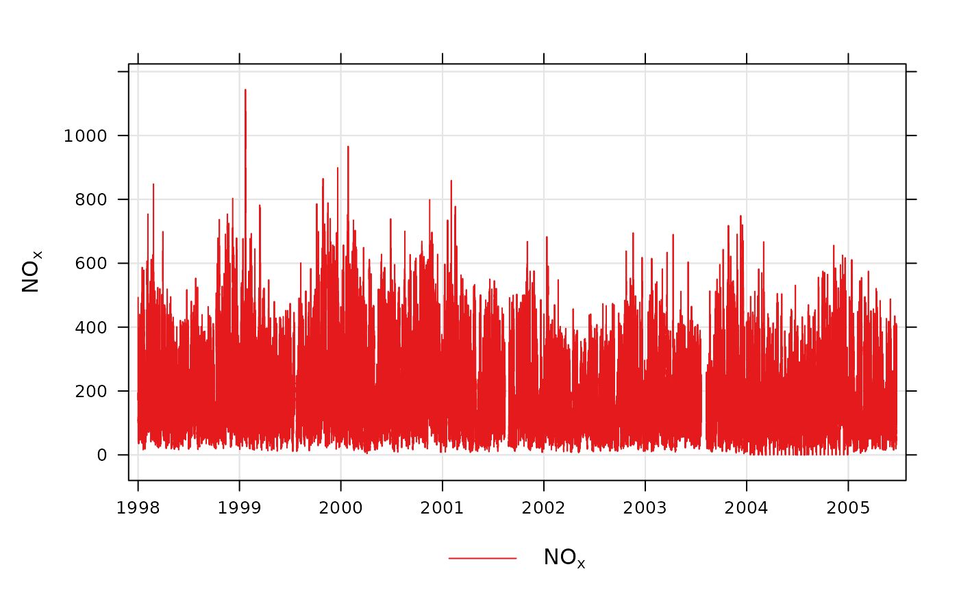
timePlot(mydata, pollutant = "nox")
 # two pollutants in separate panels
if (FALSE) { # \dontrun{
timePlot(mydata, pollutant = c("nox", "no2"))
# two pollutants in the same panel with the same scale
timePlot(mydata, pollutant = c("nox", "no2"), group = TRUE)
# group by a column (e.g. long-format data with a 'site' column)
d <- rbind(
cbind(mydata[, c("date", "nox")], site = "London"),
cbind(transform(mydata[, c("date", "nox")], nox = nox * 1.5), site = "Manchester")
)
timePlot(d, pollutant = "nox", group = "site")
# alternative by normalising concentrations and plotting on the same scale
timePlot(
mydata,
pollutant = c("nox", "co", "pm10", "so2"),
group = TRUE,
avg.time = "year",
normalise = "1/1/1998",
linewidth = 3,
linetype = 1
)
# examples of selecting by date
# plot for nox in 1999
timePlot(selectByDate(mydata, year = 1999), pollutant = "nox")
# select specific date range for two pollutants
timePlot(
selectByDate(mydata, start = "6/8/2003", end = "13/8/2003"),
pollutant = c("no2", "o3")
)
# choose different line styles etc
timePlot(mydata, pollutant = c("nox", "no2"), linetype = 1)
# choose different line styles etc
timePlot(
selectByDate(mydata, year = 2004, month = 6),
pollutant = c("nox", "no2"),
linewidth = c(1, 2),
col = "black"
)
# different averaging times
# daily mean O3
timePlot(mydata, pollutant = "o3", avg.time = "day")
# daily mean O3 ensuring each day has data capture of at least 75%
timePlot(mydata, pollutant = "o3", avg.time = "day", data.thresh = 75)
# 2-week average of O3 concentrations
timePlot(mydata, pollutant = "o3", avg.time = "2 week")
} # }
# two pollutants in separate panels
if (FALSE) { # \dontrun{
timePlot(mydata, pollutant = c("nox", "no2"))
# two pollutants in the same panel with the same scale
timePlot(mydata, pollutant = c("nox", "no2"), group = TRUE)
# group by a column (e.g. long-format data with a 'site' column)
d <- rbind(
cbind(mydata[, c("date", "nox")], site = "London"),
cbind(transform(mydata[, c("date", "nox")], nox = nox * 1.5), site = "Manchester")
)
timePlot(d, pollutant = "nox", group = "site")
# alternative by normalising concentrations and plotting on the same scale
timePlot(
mydata,
pollutant = c("nox", "co", "pm10", "so2"),
group = TRUE,
avg.time = "year",
normalise = "1/1/1998",
linewidth = 3,
linetype = 1
)
# examples of selecting by date
# plot for nox in 1999
timePlot(selectByDate(mydata, year = 1999), pollutant = "nox")
# select specific date range for two pollutants
timePlot(
selectByDate(mydata, start = "6/8/2003", end = "13/8/2003"),
pollutant = c("no2", "o3")
)
# choose different line styles etc
timePlot(mydata, pollutant = c("nox", "no2"), linetype = 1)
# choose different line styles etc
timePlot(
selectByDate(mydata, year = 2004, month = 6),
pollutant = c("nox", "no2"),
linewidth = c(1, 2),
col = "black"
)
# different averaging times
# daily mean O3
timePlot(mydata, pollutant = "o3", avg.time = "day")
# daily mean O3 ensuring each day has data capture of at least 75%
timePlot(mydata, pollutant = "o3", avg.time = "day", data.thresh = 75)
# 2-week average of O3 concentrations
timePlot(mydata, pollutant = "o3", avg.time = "2 week")
} # }