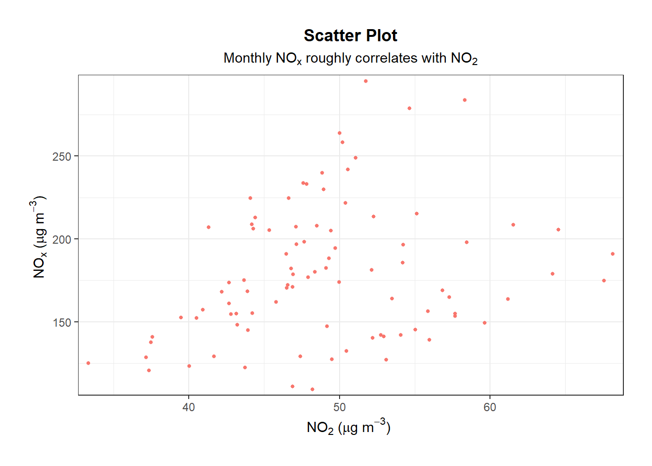
library(openair)
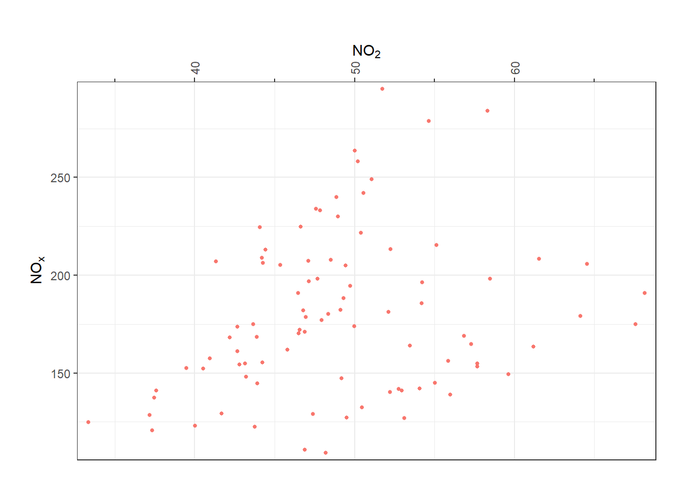
scatter_object <- scatterPlot(
mydata,
x = "no2",
y = "nox",
avg.time = "month",
plot = FALSE
)
# extract data
scatter_object$data
# extract plot
scatter_object$plotAppendix A — Customising openair plots
A frequently asked question about openair and a commonly requested feature is how to annotate plots. Since all openair functions now return ggplot2 objects, users have considerably more flexibility in adding annotations using the extensive set of tools available in ggplot2 and its extensions. Embedding annotation options directly inside every openair function would make them unnecessarily complex and still not cover every customisation users may want. Instead, because plots are returned as standard ggplot2 objects, users can build annotations incrementally, adding layers as needed.
There are several types of annotation that can be useful, including text, shapes, lines, and shading. Because many openair plots consist of multiple facets, it is also important to understand how to target specific panels when adding annotations. The approaches described here apply broadly to all openair plots - the only differences concern the coordinate system used.
The foundation of annotation in the new openair is the ggplot2 layering system. Annotations can be added with standard geoms such as ggplot2::geom_text(), ggplot2::geom_label(), ggplot2::geom_rect(), ggplot2::geom_segment(), or using helper functions like `ggplot2::annotate(). Since the output is a normal ggplot object, users can modify it by adding layers with the + operator, adjusting scales, or adding specialised annotation layers from packages such as ggrepel, ggforce, or patchwork for more complex layouts.
One quirk of openair to be aware of is that plotting functions do not return a plot, they return an openair object which contains the plot, the plot data, and the function call. One tip is to use plot = FALSE, which tells the function to not print the plot at time of object creation.
To make life easier, lets load the ggplot2 package:
A good introduction to tweaking plots is using labs() to change the axis labels. With ggplot2 you simply add (with +) new layers. Feel free to use quickText() directly here too for automatic formatting.
labs() to change axis labels and title.
A.1 Annotations
A.1.1 Adding text
To add text, use ggplot2::annotate() with geom = "text" and specify the coordinates, colour and label. In this example, the text ‘This is high!’ is added to the right of the plot at a y-value of 300.
scatter_object$plot +
  annotate(
    geom = "text",
    x = 48.5,
    y = 300,
    colour = "blue",
    label = "This is high!"
  )
annotate().
A.1.2 Adding a shaded area
For a shaded area, use geom = "rect" and specify the coordinates of the rectangle. In this example, a semi-transparent orange rectangle is added to highlight a region of interest. Note that the alpha parameter controls the transparency of the rectangle, with values closer to 0 being more transparent and values closer to 1 being more opaque. We also use fill over colour to specify the fill colour of the rectangle; colour could be used to specify the border colour if desired.

annotate().
A.1.3 Adding an arrow
To add an arrow, use geom = "segment" and specify the coordinates of the start and end points, along with the arrow parameter to define the arrowhead. In this example, an arrow is added pointing from (40, 150) to (60, 250). Note that arrow(ends = "both") creates arrowheads at both ends of the segment, and linewidth controls the thickness of the arrow line. The arrow() function also has additional parameters such as angle and length to further customize the appearance of the arrowheads.
annotate().
A.1.4 Highlight a specific point
To highlight a point, you can use geom = "point" and specify the coordinates of the point you want to highlight. For example, to highlight the point with the maximum NO2 concentration, you can first extract that point from the data and then add it as an annotation. Note that different openair plots will have different data structures, so explore what’s available for your specific plot of interest.
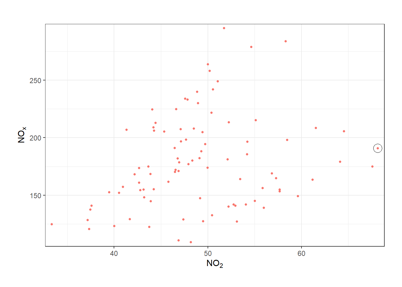
annotate().
A.1.5 Add a reference line
To add a reference line, you use ggplot2::geom_hline() or ggplot2::geom_vline(). In this example, a horizontal dashed purple line is added at y = 200, along with an annotation to label it as “Limit”. The linetype parameter controls the line type (e.g., dashed, dotted), and color specifies the color of the line.
In this case, we set x = I(0.01). The I() function tells ggplot2 to ignore the data scale (e.g., 30 to 70 units of NO2) and instead use a relative scale (0 at the far left, 1 at the far right). This is really helpful - for example, you may create a lot of different timePlot() plots with different x-axis scales - x = I(0.01) will always mean “nudged a little bit from the far left of the plot”.
scatter_object$plot +
  geom_hline(
    yintercept = 200,
    linetype = 2,
    color = "purple"
  ) +
  annotate(
    geom = "text",
    y = 205,
    x = I(0.01),
    vjust = 0,
    hjust = 0,
    label = "Limit",
    color = "purple"
  )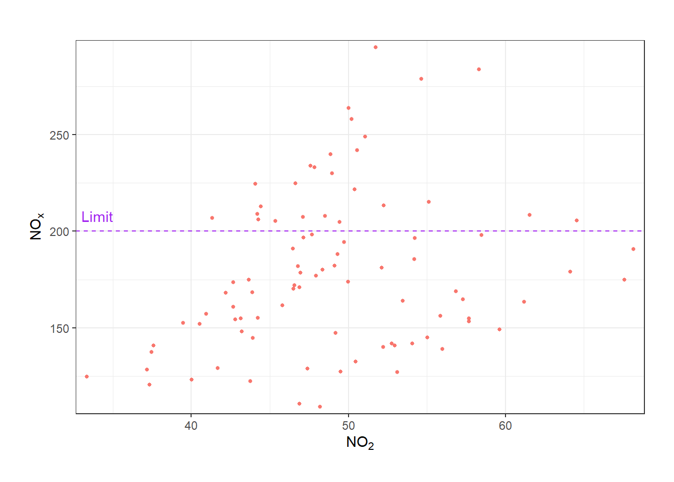
geom_hline() and annotating it.
A.1.6 Working with dates
Working with dates (e.g., for plots like timePlot()) is a step more challenging, but is mostly identical to what has already been covered. ISOdate() is convenient way to create date(times) in R to plug into annotate() and similar functions. In this example, we add a vertical dashed line at a specific date (June 1, 2002) along with an annotation to label. The xintercept parameter specifies the position of the vertical line, and the annotate() function is used to add text at a specific date and y-value. The hjust and vjust parameters control the horizontal and vertical justification of the text, respectively.
no2_timeplot <- timePlot(mydata, "no2", avg.time = "month", plot = FALSE)$plot

no2_timeplot +
  geom_vline(
    xintercept = ISOdate(2002, 6, 1, 0),
    linetype = 2,
    color = "grey25"
  ) +
  annotate(
    geom = "text",
    x = ISOdate(2002, 5, 5, 0),
    y = I(0.975),
    label = "What happened\nhere?",
    hjust = 1,
    vjust = 1,
    color = "grey25"
  )
geom_vline() and annotating it.
A.1.7 Working with radial axes
For “radial” plots (e.g., polarPlot()) the same principles apply, but the coordinates are different. You simply need to think in “radial” coordinates - the x-axis is the ‘compass directions’ in degrees (0-360) and the y-axis is the radial axis progressing out from the centre. In this example, a vertical dashed line is added at 225 degrees, along with two rectangles to highlight specific angular regions, and text annotations to label these regions as “A”, “B”, and “C”. The annotate() function is used to add both the rectangles and the text, with appropriate coordinates for each annotation.
no2_polarplot <- polarPlot(mydata, "no2", plot = FALSE)$plot

no2_polarplot +
  geom_vline(
    xintercept = 225,
    linetype = 2,
    linewidth = 1
  ) +
  annotate(
    geom = "rect",
    xmin = 60,
    xmax = 150,
    ymin = 5,
    ymax = 20,
    fill = NA,
    color = "black",
    linewidth = 1
  ) +
  annotate(
    geom = "rect",
    xmin = -20,
    xmax = 20,
    ymin = 8,
    ymax = 18,
    fill = NA,
    color = "black",
    linewidth = 1
  ) +
  annotate(
    geom = "text",
    x = 0,
    y = 15,
    label = "A",
    size = 8
  ) +
  annotate(
    geom = "text",
    x = 105,
    y = 15,
    label = "B",
    size = 8
  ) +
  annotate(
    geom = "label",
    x = 225,
    y = 15,
    label = "C",
    size = 8,
    linewidth = 1
  )
A.1.8 Multi-panel plots
When type is used in an openair plot, multiple panels (“facets” in ggplot2 speak) are created. Further, some functions like calendarPlot() are automatically faceted. You may wish to annotate only a single panel. Use the layout argument to specify the panel of interest.
Below, we highlight Christmas day on a calendarPlot(). Note that layout = 12 means “the twelfth panel, progressing from left-to-right, top-to-bottom”. This argument could take a vector - e.g., layout = c(5, 12) - which would annotate the fifth and twelfth panels.
multipanel <- calendarPlot(mydata, "no2", year = 2000, plot = F)$plot

multipanel +
  annotate(
    geom = "rect",
    xmin = 2.5,
    xmax = 3.5,
    ymin = 1.5,
    ymax = 2.5,
    layout = 12,
    color = "black",
    fill = NA
  )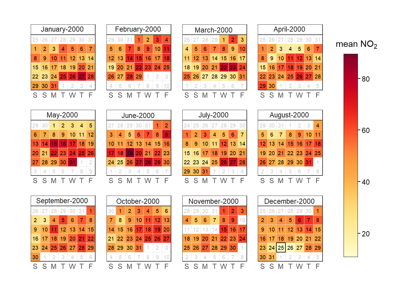
layout argument.
A.1.9 Assembly plots
A few openair plots are actually multiple plots in one. You can typically tell this because the different “panels” are arranged on an irregular grid (e.g., timeVariation()) or are comprised of very different plot types (e.g., conditionalEval()). These plots are powered by the patchwork package, which makes it simple to extract and modify sub-panels. For timeVariation(), the “top” panel can be accessed with [[1]] and the “bottom” three with [[2]][[1]], [[2]][[2]], and [[2]][[3]].1
timevar_no2 <- timeVariation(mydata, "no2", plot = FALSE)

timevar_no2$main.plot[[2]][[1]] <- timevar_no2$main.plot[[2]][[1]] +
  geom_hline(yintercept = 50)

plot(timevar_no2)
timeVariation() as an example.
A.2 Facets
One of the sets of arguments passed through ... could be described as “facet” arguments, as these influence the appearance of ‘faceted’ (i.e., multi-panel) plots. All of these arguments get passed straight through to either ggplot2::facet_wrap() or ggplot2::facet_grid() - see the documentation for these functions to learn more.
To demonstrate, lets consider this heatmap plot:
heatmap_data <- selectByDate(mydata, year = 2003:2005)
trendLevel(heatmap_data, type = "year")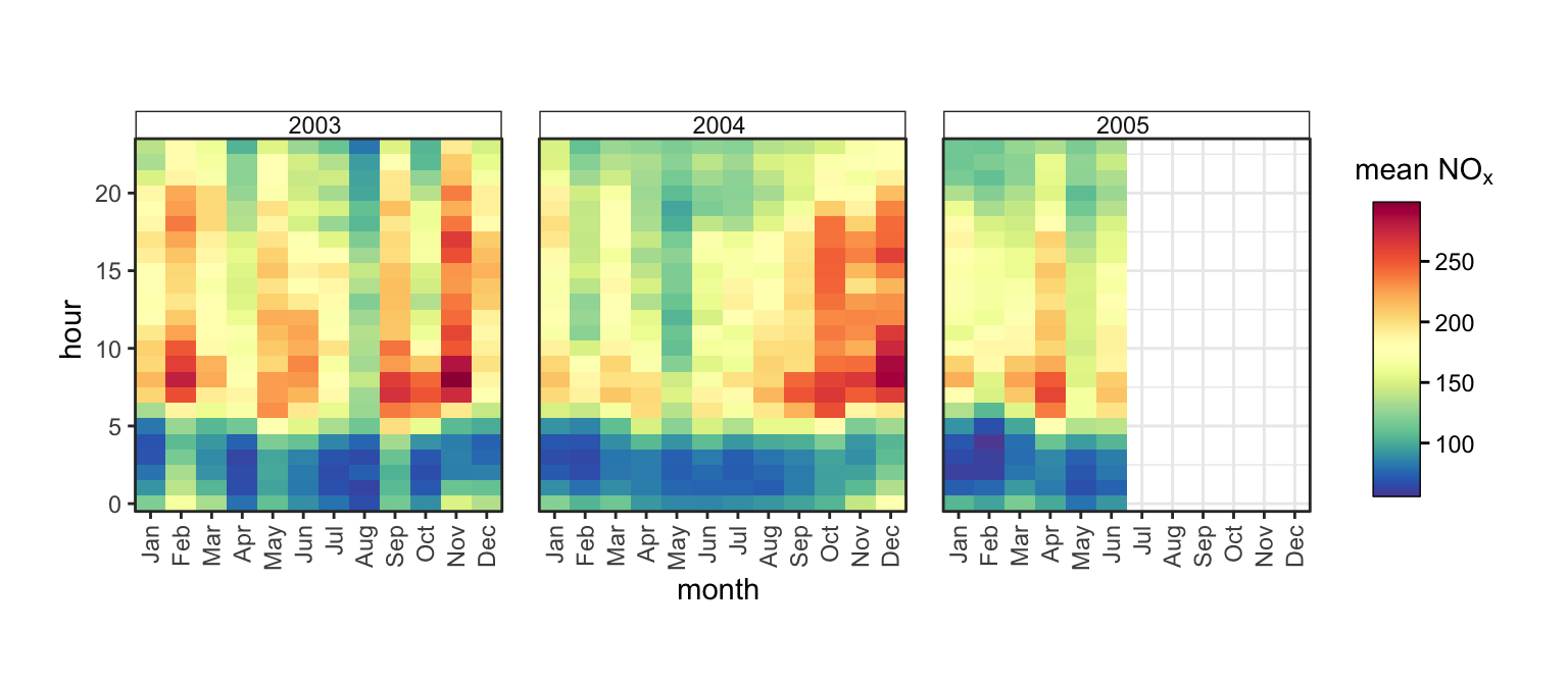
In this case, all three of the panels share the same x- and y-scales. Despite this, some readers may prefer that each of the axes are labelled, even if they are identical. The axes argument (which defaults to "margins") controls this; it can either be "all_x", "all_y" or "all" to make axes appear.
trendLevel(heatmap_data, type = "year", axes = "all")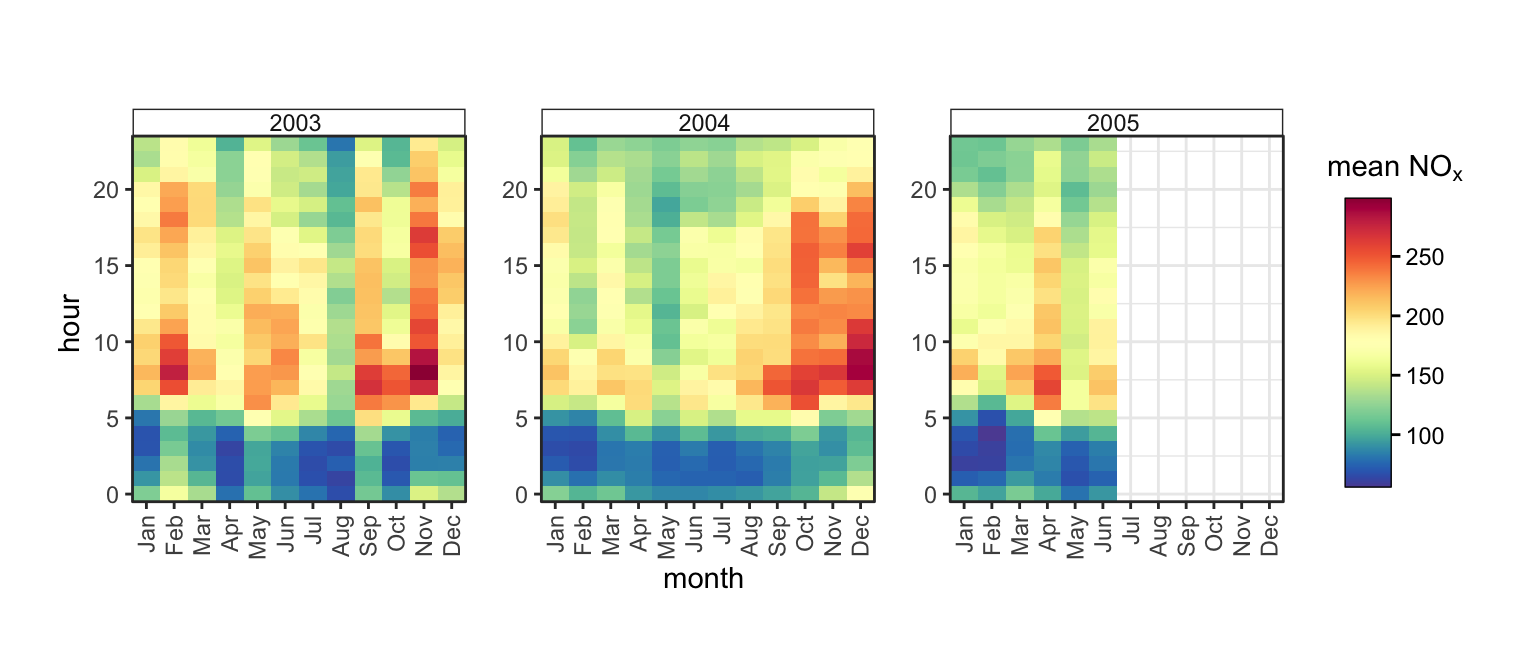
Figure A.12 clearly shows that our data finishes at the end of June 2005, meaning the rest of that panel is empty. It may be appropriate to simply exclude the rest of 2005 from our plot. To do so, we can use the scales argument, which can take "free", "free_y", "free_x" or "fixed" (the default).
trendLevel(heatmap_data, type = "year", scales = "free_x")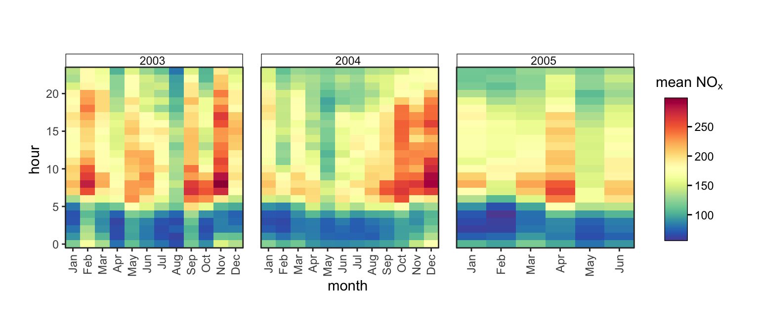
Figure A.13 is an improvement, but the way in which the 2005 panel is “stretched” is aesthetically unappealing. The space argument allows the width or heights of panels to match the scale of data displayed on the axes. When only one type is specified, this argument can either take "fixed" (the default), "free_x" or "free_y", and will force the plot to be 1 dimensional row or column of plots rather than wrapped into a square grid. In this case, our plot is already a row of three so no change is apparent. If there are two values given to type, and therefore the plot is a 2D matrix of panels, space can also take "free" to vary both x and y.
trendLevel(heatmap_data, type = "year", scales = "free_x", space = "free_x")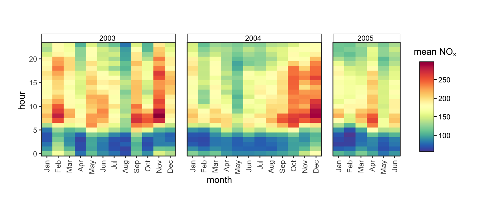
All of nrow, ncol, scales, space, axes, axis.labels, switch and strip.position can be passed through ... to be used to customise multi-panel plot layout and appearance.
Note that not all of these arguments will always work in all functions. For example, plots on radial axes like polarPlot() fix their x-axis (radial axis) range to be from 0 to 360 to represent compass directions, so scales = "free_x" will not do anything.
NoteLegacy Options
Users of older versions of openair may recall the x.relation, y.relation and layout options. These mapped onto lattice arguments, which pre-dated ggplot2 as the plotting engine for openair. These arguments are automatically remapped onto the modern ones, so old code should still work, but it is recommended to use the new arguments directly. A conversion table is provided below:
|
legacy
|
new
|
|
|---|---|---|
layout |
ncol |
nrow |
c(2, 5) |
2 |
5 |
|
legacy
|
new
|
|
|---|---|---|
x.relation |
y.relation |
scales |
'free' |
'free' |
'free' |
'same' |
'free' |
'free_y' |
'free' |
'same' |
'free_x' |
'same' |
'same' |
'fixed' |
A.3 Themes
With ggplot2 it is simple to control the “theme” of your plot (i.e., all non-data elements) using the ggplot2::theme() function. There is an excellent blog post about ggplot2 stlying at https://tidyverse.org/blog/2025/10/ggplot2-styling/, but below we demonstrate a few examples of tweaking the plot style.
scatter_object$plot +
  theme(
    text = element_text(size = 15),
    panel.grid.minor = element_line(
      linetype = 3,
      color = "cadetblue2",
      linewidth = 0.5
    ),
    panel.grid.major = element_line(
      linetype = 2,
      color = "cadetblue",
      linewidth = 0.5
    ),
    axis.title.y = element_text(
      angle = 0,
      vjust = 0.5
    ),
    axis.text.x = element_text(
      angle = 90,
      vjust = 0.5
    ),
    panel.background = element_rect(
      fill = "grey95"
    ),
    axis.line = element_line(
      linewidth = 3,
      lineend = "square"
    )
  )
theme().
It is also possible to set a global ‘complete’ theme. This could be a default ggplot2 theme, or one from an extension package. This could be helpful to ensure your openair plots align with other plots you’re already making in ggplot2.
theme_set(theme_classic())
timePlot(mydata, avg.time = "week")
To reset this behaviour, reset the global theme to theme_grey(). This is the ggplot2 default, and makes all of the openair functions restore their default behaviour. If you’d like to actually use theme_grey(), set your global theme to something like theme_grey(10.01) which is different enough to disable openair’s overrides.
Note that some functions do their own theme() manipulations, so your mileage may vary as to which of your options are honoured - or whether they do unexpected things to your plot!
A related function is guides(), which can be useful for controlling how axes and legends behave. These are typically set within openair functions, but can be overridden by more advanced users. Useful arguments include position and angle. For categorical scales, check.overlap or n.dodge can help mitigate overlapping axis labels.
scatter_object$plot +
  guides(
    x = guide_axis(
      position = "top",
      angle = 90,
      minor.ticks = TRUE
    )
  )
guides().
A.4 Extensions
There are many ggplot2 extensions out there which you can take advantage of in extending your openair plots.
One useful example is patchwork, which provides an elegant API for combining multiple plots together into one assembly. This is how timeVariaiton() works under-the-hood, but users should feel free to assemble plots however they see fit.
The package documentation for patchwork is excellent and can be found here.
library(patchwork)

p_varplot_hour <- variationPlot(
  mydata,
  "nox",
  "hour",
  caption = "",
  plot = FALSE,
  tag = "A"
)$plot

p_varplot_weekday <- variationPlot(
  mydata,
  "nox",
  "weekday",
  caption = "",
  plot = FALSE,
  tag = "B"
)$plot

p_timeplot <- timePlot(
  mydata,
  "nox",
  avg.time = "month",
  plot = FALSE,
  tag = "C"
)$plot

p_heatmap <- trendLevel(mydata, type = "default", plot = FALSE, tag = "D")$plot

(((p_varplot_hour | p_varplot_weekday) / p_timeplot) | p_heatmap) +
  plot_layout(widths = c(0.7, 0.3)) &
  theme(plot.margin = unit(rep(0, 4), "cm"))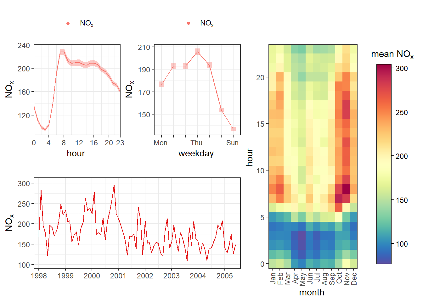
tag argument is being used to label each one with a letter
Another really useful package is geomtextpath, which combines labels and lines and paths for nicer annotations:
library(geomtextpath)

scatter_object$plot +
  annotate(
    geom = "textpath",
    x = c(40, 60),
    y = c(100, 300),
    label = "Things go up!",
    arrow = arrow()
  ) +
  geom_texthline(
    yintercept = 250,
    color = "blue",
    label = "limit value",
    hjust = 0.1,
    linetype = 2
  )
An interesting package is legendry, which has a lot of different functions for tweaking legends and guides. Of interest may be legendry::guide_colring(), which wraps a continuous legend into a doughnut. This could be useful for cyclical variables like wind direction.
This example highlights that sometimes you may need to take on further tweaks as you get deeper into customising your plots. Here, it was necessary to reset the colour scale to set appropriate labels and breaks.
scatterPlot(mydata, z = "wd", plot = FALSE)$plot +
  guides(
    color = legendry::guide_colring()
  ) +
  scale_color_gradientn(
    colours = openair::openColours("hue"),
    breaks = seq(0, 360, 90),
    labels = c("N", "E", "S", "W", "N")
  )
Many extension packages usefully provide themes that can be easily set globally to apply to openair plots. For example, for those working with or for the UK Government, the afcharts package exports afcharts::theme_af() for accessible, Government Statistical Service-approved plot styling.
afcharts::theme_af(), and creating a timePlot().
windRose(mydata, cols = "gaf.seq")
afcharts::theme_af().
Note that it may easier to use
variationPlot()and use patchwork directly yourself, depending on your use-case.↩︎