Function to to draw and visualise correlation matrices. The primary purpose is as a tool for exploratory data analysis. Hierarchical clustering is used to group similar variables.
Usage
corPlot(
  mydata,
  pollutants = NULL,
  type = "default",
  cluster = TRUE,
  method = "pearson",
  use = "pairwise.complete.obs",
  annotate = c("cor", "signif", "stars", "none"),
  dendrogram = FALSE,
  triangle = c("both", "upper", "lower"),
  diagonal = TRUE,
  breaks = NULL,
  trans = FALSE,
  cols = "default",
  theme = "default",
  r.thresh = 0.8,
  text.col = c("black", "black"),
  key.title = NULL,
  key.position = "right",
  auto.text = TRUE,
  plot = TRUE,
  key = NULL,
  ...
)
Arguments
- mydata
A data frame which should consist of some numeric columns.
- pollutants
the names of data-series in
mydatato be plotted bycorPlot. The default optionNULLand the alternative"all"use all available valid (numeric) data.- type
Character string(s) defining how data should be split/conditioned before plotting.
"default"produces a single panel using the entire dataset. Any other options will split the plot into different panels - a roughly square grid of panels if onetypeis given, or a 2D matrix of panels if twotypesare given.typeis always passed tocutData(), and can therefore be any of:A built-in type defined in
cutData()(e.g.,"season","year","weekday", etc.). For example,type = "season"will split the plot into four panels, one for each season.The name of a numeric column in
mydata, which will be split inton.levelsquantiles (defaulting to 4).The name of a character or factor column in
mydata, which will be used as-is. Commonly this could be a variable like"site"to ensure data from different monitoring sites are handled and presented separately. It could equally be any arbitrary column created by the user (e.g., whether a nearby possible pollutant source is active or not).
Most
openairplotting functions can take twotypearguments. If two are given, the first is used for the columns and the second for the rows.- cluster
Should the data be ordered according to cluster analysis. If
TRUEhierarchical clustering is applied to the correlation matrices usinghclust()to group similar variables together. With many variables clustering can greatly assist interpretation.- method
The correlation method to use. Can be
"pearson","spearman"or"kendall".- use
How to handle missing values in the
corfunction. The default is"pairwise.complete.obs". Care should be taken with the choice of how to handle missing data when considering pair-wise correlations.- annotate
What to annotate each correlation tile with. One of:
"cor", the correlation coefficient to 2 decimal places."signif", an X marker if the correlation is significant."stars", standard significance stars."none", no annotation.
- dendrogram
Should a dendrogram be plotted? When
TRUEa dendrogram is shown on the plot. Note that this will only work fortype = "default". Defaults toFALSE.- triangle
Which 'triangles' of the correlation plot should be shown? Can be
"both","lower"or"upper". Defaults to"both".- diagonal
Should the 'diagonal' of the correlation plot be shown? The diagonal of a correlation matrix is axiomatically always
1as it represents correlating a variable with itself. Defaults toTRUE.- breaks
breaksbins a continuous axis into discrete bins. It can either take a single number (e.g.,breaks = 5) to split the scale into quantiles, a vector of numbers (e.g.,breaks = c(0, 50, 100, 200, 500) to define specific break-points, or a named list. SeebreakOpts()for more details.- trans
Should a transformation be applied to the colour scale? If the distribution of data is skewed, the default scale may be dominated by a few high values, so a log or square-root transform may mean the whole colour scale is better presented on the plot. Can be:
FALSE, which performs no transform.TRUE, which uses an appropriate transform for the plot type (usually"log10").A
scales'transform' object (e.g.,scales::transform_log10()).A character string corresponding to a
scalestransform function. Useful options include"sqrt","log10","log2","log1p","pseudo_log"and"reverse".
- cols
Colours to use for plotting. Can be a pre-set palette (e.g.,
"turbo","viridis","tol","Dark2", etc.) or a user-defined vector of R colours (e.g.,c("yellow", "green", "blue", "black")- seecolours()for a full list) or hex-codes (e.g.,c("#30123B", "#9CF649", "#7A0403")). Alternatively, can be a list of arguments to control the colour palette more closely (e.g.,palette,direction,alpha, etc.). SeeopenColours()andcolourOpts()for more details.- theme
A string representing an overall plot theme, defaulting to
"default". This option makes sweeping changes to non-data plot features such as fonts, colours, line widths, and so on, and may also change default arguments likecolsif not set by the user. Can also take aggplot2::theme()object, which will be used to modify the"default"theme. Pre-set options include:"default", a lattice-inspired theme resembling the traditionalopenairlook, with structured panels and visible gridlines."dark", a dark-background variant of the default theme, designed for presentations and low-light viewing, using high-contrast text and colour palettes optimised for visibility against dark panels."modern", a minimalist, contemporary theme inspired by tools such as Plotly and Observable Plot, with reduced visual clutter, horizontal emphasis in gridlines, a clean legend style, and typography suited to dashboards and reports."soft", a low-contrast, 'editorial' theme with warm background tones, subtle gridlines, and gently desaturated colours, designed for reports and publication-style figures, particularly where a calmer appearance improves readability."print", a strictly greyscale theme optimised for black-and-white reproduction, with stronger structural elements such as clearer gridlines and axis definitions to ensure good contrast and readability in printed or photocopied outputs.
Please note that if a global theme is set with
ggplot2::theme_set()to anything other than the defaultggplot2::theme_grey(), the selected openair theme will not be fully applied; instead, only minimal adjustments (such as legend positioning) will be made.- r.thresh
Values of greater than
r.threshwill be shown in bold type. This helps to highlight high correlations.- text.col
The colour of the text used to show the correlation values. The first value controls the colour of negative correlations and the second positive.
- key.title
Used to set the title of the legend. The legend title is passed to
quickText()ifauto.text = TRUE.- key.position
Location where the legend is to be placed. Allowed arguments include
"top","right","bottom","left"and"none", the last of which removes the legend entirely.- auto.text
Either
TRUE(default) orFALSE. IfTRUEtitles and axis labels will automatically try and format pollutant names and units properly, e.g., by subscripting the "2" in "NO2". Passed toquickText().- plot
When
openairplots are created they are automatically printed to the active graphics device.plot = FALSEdeactivates this behaviour. This may be useful when the plot data is of more interest, or the plot is required to appear later (e.g., later in a Quarto document, or to be saved to a file).- key
Deprecated; please use
key.position. IfFALSE, setskey.positionto"none".- ...
Addition options are passed on to
cutData()fortypehandling. Some additional arguments are also available, varying somewhat in different plotting functions:title,subtitle,caption,tag,xlabandylabcontrol the plot title, subtitle, caption, tag, x-axis label and y-axis label, passed toggplot2::labs()viaquickText()ifauto.text = TRUE.xlim,ylimandlimitscontrol the limits of the x-axis, y-axis and colorbar scales.ncolandnrowset the number of columns and rows in a faceted plot.scalescan be"fixed","free_x","free_y"or"free"to control whether axes are shared across facets when usingtype. Also supported are the legacyx.relationandy.relation, which can be either"same"or"free"and get remapped toscalesautomatically.Similarly,
space,axes,axis.labels,switchandstrip.positioncan be used to customise the appearance of faceted plots. Seeggplot2::facet_wrap()andggplot2::facet_grid()for the arguments these take.fontsizeoverrides the overall font size of the plot by setting thetextargument ofggplot2::theme(). It may also be applied proportionately to anyopenairannotations (e.g., N/E/S/W labels on polar coordinate plots).Various graphical parameters are also supported:
linewidth,linetype,shape,size,border, andalpha. Not all parameters apply to all plots. These can take a single value, or a vector of multiple values - e.g.,shape = c(1, 2)- which will be recycled to the length of values needed.lineend,linejoinandlinemitretweak the appearance of line plots; seeggplot2::geom_line()for more information.In polar coordinate plots,
annotate = FALSEwill remove the N/E/S/W labels and any other annotations.
Value
an openair object
Details
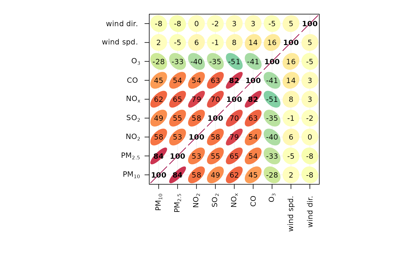
The corPlot() function plots correlation matrices. The implementation
relies heavily on that shown in Sarkar (2007), with a few extensions.
Correlation matrices are a very effective way of understating relationships
between many variables. The corPlot() shows the correlation coded in three
ways: by shape (ellipses), colour and the numeric value. The ellipses can be
thought of as visual representations of scatter plot. With a perfect positive
correlation a line at 45 degrees positive slope is drawn. For zero
correlation the shape becomes a circle. See examples below.
With many different variables it can be difficult to see relationships
between variables, i.e., which variables tend to behave most like one
another. For this reason hierarchical clustering is applied to the
correlation matrices to group variables that are most similar to one another
(if cluster = TRUE).
If clustering is chosen it is also possible to add a dendrogram using the
option dendrogram = TRUE. Note that dendrogramscan only be plotted for
type = "default" i.e. when there is only a single panel. The dendrogram can
also be recovered from the plot object itself and plotted more clearly; see
examples below.
It is also possible to use the openair type option to condition the data in
many flexible ways, although this may become difficult to visualise with too
many panels.
Examples
# basic plot
corPlot(mydata)


if (FALSE) { # \dontrun{
# plot by season
corPlot(mydata, type = "season")

# recover dendrogram when cluster = TRUE and plot it
res <- corPlot(mydata, plot = FALSE)
plot(res$clust)

# a more interesting are hydrocarbon measurements
hc <- importAURN(site = "my1", year = 2005, hc = TRUE)

# now it is possible to see the hydrocarbons that behave most
# similarly to one another
corPlot(hc)
} # }
if (FALSE) { # \dontrun{
# plot by season
corPlot(mydata, type = "season")
# recover dendrogram when cluster = TRUE and plot it
res <- corPlot(mydata, plot = FALSE)
plot(res$clust)
# a more interesting are hydrocarbon measurements
hc <- importAURN(site = "my1", year = 2005, hc = TRUE)
# now it is possible to see the hydrocarbons that behave most
# similarly to one another
corPlot(hc)
} # }