Function to plot wind speed/direction frequencies and other statistics
Source:R/polarFreq.R
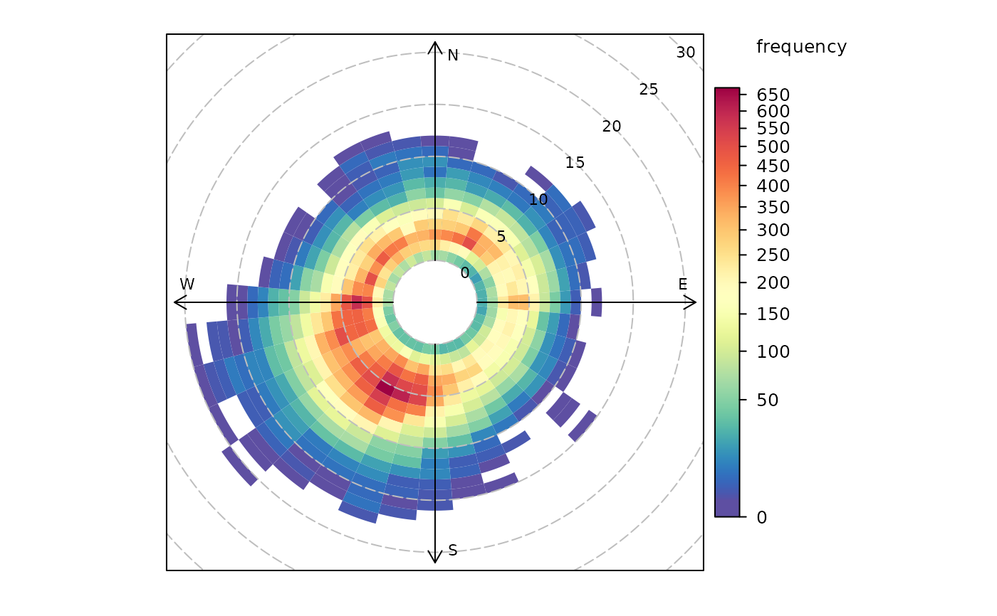
polarFreq.RdpolarFreq primarily plots wind speed-direction frequencies in
‘bins’. Each bin is colour-coded depending on the frequency of
measurements. Bins can also be used to show the concentration of pollutants
using a range of commonly used statistics.
Usage
polarFreq(
  mydata,
  pollutant = NULL,
  ws = "ws",
  wd = "wd",
  statistic = "frequency",
  ws.int = 1,
  wd.nint = 36,
  grid.line = 5,
  limits = NULL,
  breaks = NULL,
  trans = "sqrt",
  cols = "default",
  theme = "default",
  type = "default",
  min.bin = 1,
  ws.upper = NA,
  angle.scale = 45,
  offset = 10,
  border.col = "transparent",
  key.title = paste(statistic, pollutant, sep = " "),
  key.position = "right",
  auto.text = TRUE,
  plot = TRUE,
  key = NULL,
  ...
)
Arguments
- mydata
A data frame minimally containing a wind speed, a decimal wind direction, and
date.- pollutant
Mandatory. A pollutant name corresponding to a variable in a data frame should be supplied e.g.
pollutant = "nox"- ws
The name of the column in
mydatarepresenting the wind speed. Defaults to"ws".- wd
The name of the column in
mydatarepresenting the decimal wind direction, 0 to 360 where 0/360 are North and 180 is South. Defaults to"wd".- statistic
The statistic that should be applied to each wind speed/direction bin. Can be one of:
"frequency": the simplest and plots the frequency of wind speed/direction in different bins. The scale therefore shows the counts in each bin."mean","median","max"(maximum),"stdev"(standard deviation): Plots the relevant summary statistic of a pollutant in wind speed/direction bins."weighted.mean"will plot the concentration of a pollutant weighted by wind speed/direction. Each segment therefore provides the percentage overall contribution to the total concentration.
Note that for options other than
"frequency", it is necessary to also provide the name of apollutant.- ws.int
Wind speed interval assumed. In some cases e.g. a low met mast, an interval of 0.5 may be more appropriate.
- wd.nint
Number of intervals of wind direction.
- grid.line
Radial spacing of grid lines.
- limits
The limits of the colour scale, in the form
c(lower, upper). For example,limits = c(0, 100)will set the colour scale to be between0and100. Values greater than100will be coloured as if they were100, and those lower than0will be coloured as if they were0.limitscan be wider than the range of the data, which can be useful for ensuring multiple plots share the same colour scale.- breaks
breaksbins a continuous axis into discrete bins. It can either take a single number (e.g.,breaks = 5) to split the scale into quantiles, a vector of numbers (e.g.,breaks = c(0, 50, 100, 200, 500) to define specific break-points, or a named list. SeebreakOpts()for more details.- trans
Should a transformation be applied to the colour scale? If the distribution of data is skewed, the default scale may be dominated by a few high values, so a log or square-root transform may mean the whole colour scale is better presented on the plot. Can be:
FALSE, which performs no transform.TRUE, which uses an appropriate transform for the plot type (usually"log10").A
scales'transform' object (e.g.,scales::transform_log10()).A character string corresponding to a
scalestransform function. Useful options include"sqrt","log10","log2","log1p","pseudo_log"and"reverse".
- cols
Colours to use for plotting. Can be a pre-set palette (e.g.,
"turbo","viridis","tol","Dark2", etc.) or a user-defined vector of R colours (e.g.,c("yellow", "green", "blue", "black")- seecolours()for a full list) or hex-codes (e.g.,c("#30123B", "#9CF649", "#7A0403")). Alternatively, can be a list of arguments to control the colour palette more closely (e.g.,palette,direction,alpha, etc.). SeeopenColours()andcolourOpts()for more details.- theme
A string representing an overall plot theme, defaulting to
"default". This option makes sweeping changes to non-data plot features such as fonts, colours, line widths, and so on, and may also change default arguments likecolsif not set by the user. Can also take aggplot2::theme()object, which will be used to modify the"default"theme. Pre-set options include:"default", a lattice-inspired theme resembling the traditionalopenairlook, with structured panels and visible gridlines."dark", a dark-background variant of the default theme, designed for presentations and low-light viewing, using high-contrast text and colour palettes optimised for visibility against dark panels."modern", a minimalist, contemporary theme inspired by tools such as Plotly and Observable Plot, with reduced visual clutter, horizontal emphasis in gridlines, a clean legend style, and typography suited to dashboards and reports."soft", a low-contrast, 'editorial' theme with warm background tones, subtle gridlines, and gently desaturated colours, designed for reports and publication-style figures, particularly where a calmer appearance improves readability."print", a strictly greyscale theme optimised for black-and-white reproduction, with stronger structural elements such as clearer gridlines and axis definitions to ensure good contrast and readability in printed or photocopied outputs.
Please note that if a global theme is set with
ggplot2::theme_set()to anything other than the defaultggplot2::theme_grey(), the selected openair theme will not be fully applied; instead, only minimal adjustments (such as legend positioning) will be made.- type
Character string(s) defining how data should be split/conditioned before plotting.
"default"produces a single panel using the entire dataset. Any other options will split the plot into different panels - a roughly square grid of panels if onetypeis given, or a 2D matrix of panels if twotypesare given.typeis always passed tocutData(), and can therefore be any of:A built-in type defined in
cutData()(e.g.,"season","year","weekday", etc.). For example,type = "season"will split the plot into four panels, one for each season.The name of a numeric column in
mydata, which will be split inton.levelsquantiles (defaulting to 4).The name of a character or factor column in
mydata, which will be used as-is. Commonly this could be a variable like"site"to ensure data from different monitoring sites are handled and presented separately. It could equally be any arbitrary column created by the user (e.g., whether a nearby possible pollutant source is active or not).
Most
openairplotting functions can take twotypearguments. If two are given, the first is used for the columns and the second for the rows.- min.bin
The minimum number of points allowed in a wind speed/wind direction bin. The default is 1. A value of two requires at least 2 valid records in each bin an so on; bins with less than 2 valid records are set to NA. Care should be taken when using a value > 1 because of the risk of removing real data points. It is recommended to consider your data with care. Also, the
polarFreqfunction can be of use in such circumstances.- ws.upper
A user-defined upper wind speed to use. This is useful for ensuring a consistent scale between different plots. For example, to always ensure that wind speeds are displayed between 1-10, set
ws.int = 10.- angle.scale
In radial plots (e.g.,
polarPlot()), the radial scale is drawn directly on the plot itself. While suitable defaults have been chosen, sometimes the placement of the scale may interfere with an interesting feature.angle.scalecan take any value between0and360to place the scale at a different angle, orFALSEto move it to the side of the plots.- offset
offsetcontrols the size of the 'hole' in the middle and is expressed on a scale of0to100, where0is no hole and100is a hole that takes up the entire plotting area.- border.col
The colour of the boundary of each wind speed/direction bin. The default is transparent. Another useful choice sometimes is "white".
- key.title
Used to set the title of the legend. The legend title is passed to
quickText()ifauto.text = TRUE.- key.position
Location where the legend is to be placed. Allowed arguments include
"top","right","bottom","left"and"none", the last of which removes the legend entirely.- auto.text
Either
TRUE(default) orFALSE. IfTRUEtitles and axis labels will automatically try and format pollutant names and units properly, e.g., by subscripting the "2" in "NO2". Passed toquickText().- plot
When
openairplots are created they are automatically printed to the active graphics device.plot = FALSEdeactivates this behaviour. This may be useful when the plot data is of more interest, or the plot is required to appear later (e.g., later in a Quarto document, or to be saved to a file).- key
Deprecated; please use
key.position. IfFALSE, setskey.positionto"none".- ...
Addition options are passed on to
cutData()fortypehandling. Some additional arguments are also available, varying somewhat in different plotting functions:title,subtitle,caption,tag,xlabandylabcontrol the plot title, subtitle, caption, tag, x-axis label and y-axis label, passed toggplot2::labs()viaquickText()ifauto.text = TRUE.xlim,ylimandlimitscontrol the limits of the x-axis, y-axis and colorbar scales.ncolandnrowset the number of columns and rows in a faceted plot.scalescan be"fixed","free_x","free_y"or"free"to control whether axes are shared across facets when usingtype. Also supported are the legacyx.relationandy.relation, which can be either"same"or"free"and get remapped toscalesautomatically.Similarly,
space,axes,axis.labels,switchandstrip.positioncan be used to customise the appearance of faceted plots. Seeggplot2::facet_wrap()andggplot2::facet_grid()for the arguments these take.fontsizeoverrides the overall font size of the plot by setting thetextargument ofggplot2::theme(). It may also be applied proportionately to anyopenairannotations (e.g., N/E/S/W labels on polar coordinate plots).Various graphical parameters are also supported:
linewidth,linetype,shape,size,border, andalpha. Not all parameters apply to all plots. These can take a single value, or a vector of multiple values - e.g.,shape = c(1, 2)- which will be recycled to the length of values needed.lineend,linejoinandlinemitretweak the appearance of line plots; seeggplot2::geom_line()for more information.In polar coordinate plots,
annotate = FALSEwill remove the N/E/S/W labels and any other annotations.
Value
an openair object
Details
polarFreq is its default use provides details of wind speed and direction
frequencies. In this respect it is similar to windRose(), but considers
wind direction intervals of 10 degrees and a user-specified wind speed
interval. The frequency of wind speeds/directions formed by these
‘bins’ is represented on a colour scale.
The polarFreq function is more flexible than either windRose() or
polarPlot(). It can, for example, also consider pollutant concentrations
(see examples below). Instead of the number of data points in each bin, the
concentration can be shown. Further, a range of statistics can be used to
describe each bin - see statistic above. Plotting mean concentrations is
useful for source identification and is the same as polarPlot() but without
smoothing, which may be preferable for some data. Plotting with statistic = "weighted.mean" is particularly useful for understanding the relative
importance of different source contributions. For example, high mean
concentrations may be observed for high wind speed conditions, but the
weighted mean concentration may well show that the contribution to overall
concentrations is very low.
polarFreq also offers great flexibility with the scale used and the user
has fine control over both the range, interval and colour.
See also
Other polar directional analysis functions:
percentileRose(),
polarAnnulus(),
polarCluster(),
polarDiff(),
polarPlot(),
pollutionRose(),
windRose()
Examples
# basic wind frequency plot
polarFreq(mydata)


# wind frequencies by year
if (FALSE) { # \dontrun{
polarFreq(mydata, type = "year")
} # }


# mean SO2 by year, showing only bins with at least 2 points
if (FALSE) { # \dontrun{
polarFreq(mydata, pollutant = "so2", type = "year", statistic = "mean", min.bin = 2)
} # }

# weighted mean SO2 by year, showing only bins with at least 2 points
if (FALSE) { # \dontrun{
polarFreq(mydata,
  pollutant = "so2", type = "year", statistic = "weighted.mean",
  min.bin = 2
)
} # }

# windRose for just 2000 and 2003 with different colours
if (FALSE) { # \dontrun{
polarFreq(subset(mydata, format(date, "%Y") %in% c(2000, 2003)),
  type = "year", cols = "turbo"
)
} # }

# user defined breaks from 0-700 in intervals of 100 (note linear scale)
if (FALSE) { # \dontrun{
polarFreq(mydata, breaks = seq(0, 700, 100))
} # }

# more complicated user-defined breaks - useful for highlighting bins
# with a certain number of data points
if (FALSE) { # \dontrun{
polarFreq(mydata, breaks = c(0, 10, 50, 100, 250, 500, 700))
} # }

# source contribution plot and use of offset option
if (FALSE) { # \dontrun{
polarFreq(
  mydata,
  pollutant = "pm25",
  statistic = "weighted.mean",
  offset = 50,
  ws.int = 25,
  trans = FALSE
)
} # }
# wind frequencies by year
if (FALSE) { # \dontrun{
polarFreq(mydata, type = "year")
} # }
# mean SO2 by year, showing only bins with at least 2 points
if (FALSE) { # \dontrun{
polarFreq(mydata, pollutant = "so2", type = "year", statistic = "mean", min.bin = 2)
} # }
# weighted mean SO2 by year, showing only bins with at least 2 points
if (FALSE) { # \dontrun{
polarFreq(mydata,
pollutant = "so2", type = "year", statistic = "weighted.mean",
min.bin = 2
)
} # }
# windRose for just 2000 and 2003 with different colours
if (FALSE) { # \dontrun{
polarFreq(subset(mydata, format(date, "%Y") %in% c(2000, 2003)),
type = "year", cols = "turbo"
)
} # }
# user defined breaks from 0-700 in intervals of 100 (note linear scale)
if (FALSE) { # \dontrun{
polarFreq(mydata, breaks = seq(0, 700, 100))
} # }
# more complicated user-defined breaks - useful for highlighting bins
# with a certain number of data points
if (FALSE) { # \dontrun{
polarFreq(mydata, breaks = c(0, 10, 50, 100, 250, 500, 700))
} # }
# source contribution plot and use of offset option
if (FALSE) { # \dontrun{
polarFreq(
mydata,
pollutant = "pm25",
statistic = "weighted.mean",
offset = 50,
ws.int = 25,
trans = FALSE
)
} # }