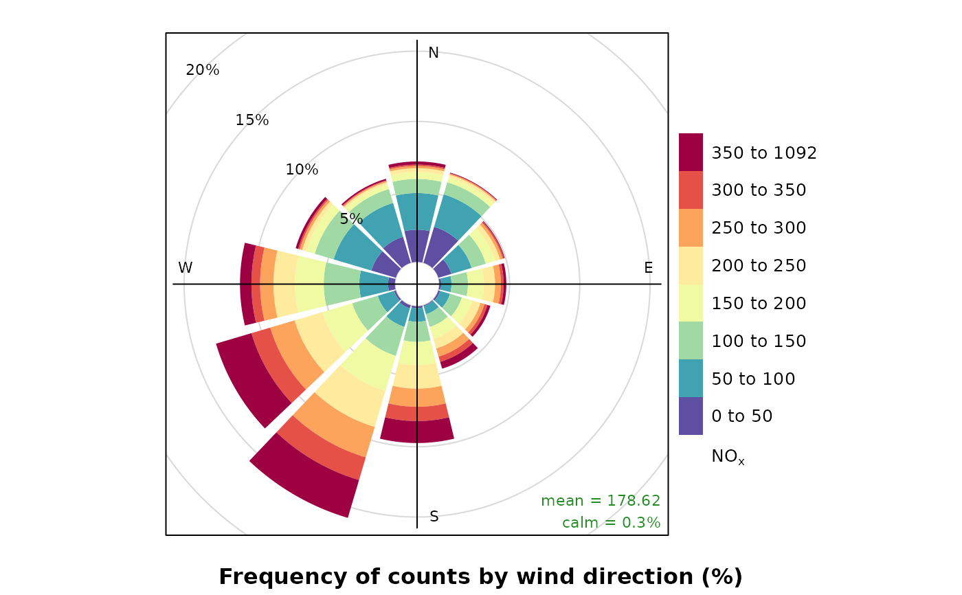
The traditional wind rose plot that plots wind speed and wind direction by different intervals. The pollution rose applies the same plot structure but substitutes other measurements, most commonly a pollutant time series, for wind speed.
Usage
pollutionRose(
mydata,
pollutant = "nox",
key.title = pollutant,
key.position = "right",
breaks = 6,
paddle = FALSE,
seg = 0.9,
normalise = FALSE,
plot = TRUE,
key = NULL,
...
)Arguments
- mydata
A data frame containing fields
wsandwd- pollutant
Mandatory. A pollutant name corresponding to a variable in a data frame should be supplied e.g.
pollutant = "nox".- key.title
Used to set the title of the legend. The legend title is passed to
quickText()ifauto.text = TRUE.- key.position
Location where the legend is to be placed. Allowed arguments include
"top","right","bottom","left"and"none", the last of which removes the legend entirely.- breaks
Most commonly, the number of break points for pollutant concentrations. The default, 6, attempts to breaks the supplied data at approximately 6 sensible break points. However,
breakscan also be used to set specific break points. For example, the argumentbreaks = c(0, 1, 10, 100)breaks the data into segments <1, 1-10, 10-100, >100.- paddle
Either
TRUEorFALSE. IfTRUEplots rose using 'paddle' style spokes. IfFALSEplots rose using 'wedge' style spokes.- seg
segdetermines with width of the segments. For example,seg = 0.5will produce segments 0.5 *angle.- normalise
If
TRUEeach wind direction segment is normalised to equal one. This is useful for showing how the concentrations (or other parameters) contribute to each wind sector when the proportion of time the wind is from that direction is low. A line showing the probability that the wind directions is from a particular wind sector is also shown.- plot
When
openairplots are created they are automatically printed to the active graphics device.plot = FALSEdeactivates this behaviour. This may be useful when the plot data is of more interest, or the plot is required to appear later (e.g., later in a Quarto document, or to be saved to a file).- key
Deprecated; please use
key.position. IfFALSE, setskey.positionto"none".- ...
Arguments passed on to
windRosewsName of the column representing wind speed.
wdName of the column representing wind direction.
ws2,wd2The user can supply a second set of wind speed and wind direction values with which the first can be compared. See
pollutionRose()for more details.ws.intThe Wind speed interval. Default is 2 m/s but for low met masts with low mean wind speeds a value of 1 or 0.5 m/s may be better.
angleDefault angle of “spokes” is 30. Other potentially useful angles are 45 and 10. Note that the width of the wind speed interval may need adjusting using
width.calm.threshBy default, conditions are considered to be calm when the wind speed is zero. The user can set a different threshold for calms be setting
calm.threshto a higher value. For example,calm.thresh = 0.5will identify wind speeds below 0.5 as calm.bias.corrWhen
angledoes not divide exactly into 360 a bias is introduced in the frequencies when the wind direction is already supplied rounded to the nearest 10 degrees, as is often the case. For example, ifangle = 22.5, N, E, S, W will include 3 wind sectors and all other angles will be two. A bias correction can made to correct for this problem. A simple method according to Applequist (2012) is used to adjust the frequencies.grid.lineGrid line interval to use. If
NULL, as in default, this is assigned based on the available data range. However, it can also be forced to a specific value, e.g.grid.line = 10.grid.linecan also be a list to control the interval, line type and colour. For examplegrid.line = list(value = 10, lty = 5, col = "purple").widthFor paddle = TRUE, the adjustment factor for width of wind speed intervals. For example, width = 1.5 will make the paddle width 1.5 times wider.
max.freqControls the scaling used by setting the maximum value for the radial limits. This is useful to ensure several plots use the same radial limits.
dig.labThe number of significant figures at which scientific number formatting is used in break point and key labelling. Default 5.
include.lowestLogical. If
FALSE(the default), the first interval will be left exclusive and right inclusive. IfTRUE, the first interval will be left and right inclusive. Passed to theinclude.lowestargument ofcut().statisticThe
statisticto be applied to each data bin in the plot. Options currently include “prop.count”, “prop.mean” and “abs.count”. The default “prop.count” sizes bins according to the proportion of the frequency of measurements. Similarly, “prop.mean” sizes bins according to their relative contribution to the mean. “abs.count” provides the absolute count of measurements in each bin.annotateIf
TRUEthen the percentage calm and mean values are printed in each panel together with a description of the statistic below the plot. IfFALSEthen only the statistic will be printed.borderBorder colour for shaded areas. Default is no border.
typeCharacter string(s) defining how data should be split/conditioned before plotting.
"default"produces a single panel using the entire dataset. Any other options will split the plot into different panels - a roughly square grid of panels if onetypeis given, or a 2D matrix of panels if twotypesare given.typeis always passed tocutData(), and can therefore be any of:A built-in type defined in
cutData()(e.g.,"season","year","weekday", etc.). For example,type = "season"will split the plot into four panels, one for each season.The name of a numeric column in
mydata, which will be split inton.levelsquantiles (defaulting to 4).The name of a character or factor column in
mydata, which will be used as-is. Commonly this could be a variable like"site"to ensure data from different monitoring sites are handled and presented separately. It could equally be any arbitrary column created by the user (e.g., whether a nearby possible pollutant source is active or not).
Most
openairplotting functions can take twotypearguments. If two are given, the first is used for the columns and the second for the rows.colsColours to use for plotting. Can be a pre-set palette (e.g.,
"turbo","viridis","tol","Dark2", etc.) or a user-defined vector of R colours (e.g.,c("yellow", "green", "blue", "black")- seecolours()for a full list) or hex-codes (e.g.,c("#30123B", "#9CF649", "#7A0403")). Alternatively, can be a list of arguments to control the colour palette more closely (e.g.,palette,direction,alpha, etc.). SeeopenColours()andcolourOpts()for more details.angle.scaleIn radial plots (e.g.,
polarPlot()), the radial scale is drawn directly on the plot itself. While suitable defaults have been chosen, sometimes the placement of the scale may interfere with an interesting feature.angle.scalecan take any value between0and360to place the scale at a different angle, orFALSEto move it to the side of the plots.offsetoffsetcontrols the size of the 'hole' in the middle and is expressed on a scale of0to100, where0is no hole and100is a hole that takes up the entire plotting area.strip.positionLocation where the facet 'strips' are located when using
type. When onetypeis provided, can be one of"left","right","bottom"or"top". When twotypes are provided, this argument defines whether the strips are "switched" and can take either"x","y", or"both". For example,"x"will switch the 'top' strip locations to the bottom of the plot.auto.textEither
TRUE(default) orFALSE. IfTRUEtitles and axis labels will automatically try and format pollutant names and units properly, e.g., by subscripting the "2" in "NO2". Passed toquickText().
Value
an openair object. Summarised proportions can be
extracted directly using the $data operator, e.g.
object$data for output <- windRose(mydata). This returns a
data frame with three set columns: cond, conditioning based on
type; wd, the wind direction; and calm, the
statistic for the proportion of data unattributed to any specific
wind direction because it was collected under calm conditions; and then
several (one for each range binned for the plot) columns giving proportions
of measurements associated with each ws or pollutant range
plotted as a discrete panel.
Details
pollutionRose() is a windRose() wrapper which brings pollutant
forward in the argument list, and attempts to sensibly rescale break points
based on the pollutant data range by by-passing ws.int.
By default, pollutionRose() will plot a pollution rose of nox using
"wedge" style segments and placing the scale key to the right of the plot.
It is possible to compare two wind speed-direction data sets using
pollutionRose(). There are many reasons for doing so e.g. to see how one
site compares with another or for meteorological model evaluation. In this
case, ws and wd are considered to the the reference data sets
with which a second set of wind speed and wind directions are to be compared
(ws2 and wd2). The first set of values is subtracted from the
second and the differences compared. If for example, wd2 was biased
positive compared with wd then pollutionRose will show the bias
in polar coordinates. In its default use, wind direction bias is colour-coded
to show negative bias in one colour and positive bias in another.
See also
Other polar directional analysis functions:
percentileRose(),
polarAnnulus(),
polarCluster(),
polarDiff(),
polarFreq(),
polarPlot(),
windRose()
Examples
# pollutionRose of nox
pollutionRose(mydata, pollutant = "nox")
# source apportionment plot - contribution to mean
if (FALSE) { # \dontrun{
pollutionRose(mydata, pollutant = "pm10", type = "year", statistic = "prop.mean")
# example of comparing 2 met sites
# first we will make some new ws/wd data with a postive bias
mydata$ws2 <- mydata$ws + 2 * rnorm(nrow(mydata)) + 1
mydata$wd2 <- mydata$wd + 30 * rnorm(nrow(mydata)) + 30
# need to correct negative wd
id <- which(mydata$wd2 < 0)
mydata$wd2[id] <- mydata$wd2[id] + 360
# results show postive bias in wd and ws
pollutionRose(mydata, ws = "ws", wd = "wd", ws2 = "ws2", wd2 = "wd2")
## add some wd bias to some nighttime hours
id <- which(as.numeric(format(mydata$date, "%H")) %in% c(23, 1, 2, 3, 4, 5))
mydata$wd2[id] <- mydata$wd[id] + 30 * rnorm(length(id)) + 120
id <- which(mydata$wd2 < 0)
mydata$wd2[id] <- mydata$wd2[id] + 360
pollutionRose(
mydata,
ws = "ws",
wd = "wd",
ws2 = "ws2",
wd2 = "wd2",
breaks = c(-11, -2, -1, -0.5, 0.5, 1, 2, 11),
cols = c("dodgerblue4", "white", "firebrick"),
type = "daylight"
)
} # }
