percentileRose() plots percentiles by wind direction with flexible
conditioning. The plot can display multiple percentile lines or filled areas.
Usage
percentileRose(
  mydata,
  pollutant = "nox",
  ws = "ws",
  wd = "wd",
  type = "default",
  percentile = c(25, 50, 75, 90, 95),
  smooth = FALSE,
  method = "default",
  cols = "default",
  theme = "default",
  angle = 10,
  mean = TRUE,
  mean.lty = 1,
  mean.lwd = 1,
  mean.col = "grey",
  fill = TRUE,
  intervals = NULL,
  angle.scale = 45,
  offset = 0,
  auto.text = TRUE,
  key.title = NULL,
  key.position = "bottom",
  plot = TRUE,
  key = NULL,
  ...
)
Arguments
- mydata
A data frame minimally containing a decimal wind direction and a numeric field to plot.
- pollutant
Mandatory. A pollutant name corresponding to a variable in a data frame should be supplied e.g.
pollutant = "nox". More than one pollutant can be supplied e.g.pollutant = c("no2", "o3")provided there is only onetype.- ws
The name of the column in
mydatarepresenting the wind speed. Defaults to"ws".- wd
The name of the column in
mydatarepresenting the decimal wind direction, 0 to 360 where 0/360 are North and 180 is South. Defaults to"wd".- type
Character string(s) defining how data should be split/conditioned before plotting.
"default"produces a single panel using the entire dataset. Any other options will split the plot into different panels - a roughly square grid of panels if onetypeis given, or a 2D matrix of panels if twotypesare given.typeis always passed tocutData(), and can therefore be any of:A built-in type defined in
cutData()(e.g.,"season","year","weekday", etc.). For example,type = "season"will split the plot into four panels, one for each season.The name of a numeric column in
mydata, which will be split inton.levelsquantiles (defaulting to 4).The name of a character or factor column in
mydata, which will be used as-is. Commonly this could be a variable like"site"to ensure data from different monitoring sites are handled and presented separately. It could equally be any arbitrary column created by the user (e.g., whether a nearby possible pollutant source is active or not).
Most
openairplotting functions can take twotypearguments. If two are given, the first is used for the columns and the second for the rows.- percentile
The percentile value(s) to plot. Must be between 0–100. If
percentile = NAthen only a mean line will be shown.- smooth
Should the wind direction data be smoothed using a cyclic spline?
- method
When
method = "default"the supplied percentiles by wind direction are calculated. Whenmethod = "cpf"the conditional probability function (CPF) is plotted and a single (usually high) percentile level is supplied. The CPF is defined as CPF = my/ny, where my is the number of samples in the wind sector y with mixing ratios greater than the overall percentile concentration, and ny is the total number of samples in the same wind sector (see Ashbaugh et al., 1985).- cols
Colours to use for plotting. Can be a pre-set palette (e.g.,
"turbo","viridis","tol","Dark2", etc.) or a user-defined vector of R colours (e.g.,c("yellow", "green", "blue", "black")- seecolours()for a full list) or hex-codes (e.g.,c("#30123B", "#9CF649", "#7A0403")). Alternatively, can be a list of arguments to control the colour palette more closely (e.g.,palette,direction,alpha, etc.). SeeopenColours()andcolourOpts()for more details.- theme
A string representing an overall plot theme, defaulting to
"default". This option makes sweeping changes to non-data plot features such as fonts, colours, line widths, and so on, and may also change default arguments likecolsif not set by the user. Can also take aggplot2::theme()object, which will be used to modify the"default"theme. Pre-set options include:"default", a lattice-inspired theme resembling the traditionalopenairlook, with structured panels and visible gridlines."dark", a dark-background variant of the default theme, designed for presentations and low-light viewing, using high-contrast text and colour palettes optimised for visibility against dark panels."modern", a minimalist, contemporary theme inspired by tools such as Plotly and Observable Plot, with reduced visual clutter, horizontal emphasis in gridlines, a clean legend style, and typography suited to dashboards and reports."soft", a low-contrast, 'editorial' theme with warm background tones, subtle gridlines, and gently desaturated colours, designed for reports and publication-style figures, particularly where a calmer appearance improves readability."print", a strictly greyscale theme optimised for black-and-white reproduction, with stronger structural elements such as clearer gridlines and axis definitions to ensure good contrast and readability in printed or photocopied outputs.
Please note that if a global theme is set with
ggplot2::theme_set()to anything other than the defaultggplot2::theme_grey(), the selected openair theme will not be fully applied; instead, only minimal adjustments (such as legend positioning) will be made.- angle
Default angle of “spokes” is when
smooth = FALSE.- mean
Show the mean by wind direction as a line?
- mean.lty
Line type for mean line.
- mean.lwd
Line width for mean line.
- mean.col
Line colour for mean line.
- fill
Should the percentile intervals be filled (default) or should lines be drawn (
fill = FALSE).- intervals
User-supplied intervals for the scale e.g.
intervals = c(0, 10, 30, 50).- angle.scale
In radial plots (e.g.,
polarPlot()), the radial scale is drawn directly on the plot itself. While suitable defaults have been chosen, sometimes the placement of the scale may interfere with an interesting feature.angle.scalecan take any value between0and360to place the scale at a different angle, orFALSEto move it to the side of the plots.- offset
offsetcontrols the size of the 'hole' in the middle and is expressed on a scale of0to100, where0is no hole and100is a hole that takes up the entire plotting area.- auto.text
Either
TRUE(default) orFALSE. IfTRUEtitles and axis labels will automatically try and format pollutant names and units properly, e.g., by subscripting the "2" in "NO2". Passed toquickText().- key.title
Used to set the title of the legend. The legend title is passed to
quickText()ifauto.text = TRUE.- key.position
Location where the legend is to be placed. Allowed arguments include
"top","right","bottom","left"and"none", the last of which removes the legend entirely.- plot
When
openairplots are created they are automatically printed to the active graphics device.plot = FALSEdeactivates this behaviour. This may be useful when the plot data is of more interest, or the plot is required to appear later (e.g., later in a Quarto document, or to be saved to a file).- key
Deprecated; please use
key.position. IfFALSE, setskey.positionto"none".- ...
Addition options are passed on to
cutData()fortypehandling. Some additional arguments are also available, varying somewhat in different plotting functions:title,subtitle,caption,tag,xlabandylabcontrol the plot title, subtitle, caption, tag, x-axis label and y-axis label, passed toggplot2::labs()viaquickText()ifauto.text = TRUE.xlim,ylimandlimitscontrol the limits of the x-axis, y-axis and colorbar scales.ncolandnrowset the number of columns and rows in a faceted plot.scalescan be"fixed","free_x","free_y"or"free"to control whether axes are shared across facets when usingtype. Also supported are the legacyx.relationandy.relation, which can be either"same"or"free"and get remapped toscalesautomatically.Similarly,
space,axes,axis.labels,switchandstrip.positioncan be used to customise the appearance of faceted plots. Seeggplot2::facet_wrap()andggplot2::facet_grid()for the arguments these take.fontsizeoverrides the overall font size of the plot by setting thetextargument ofggplot2::theme(). It may also be applied proportionately to anyopenairannotations (e.g., N/E/S/W labels on polar coordinate plots).Various graphical parameters are also supported:
linewidth,linetype,shape,size,border, andalpha. Not all parameters apply to all plots. These can take a single value, or a vector of multiple values - e.g.,shape = c(1, 2)- which will be recycled to the length of values needed.lineend,linejoinandlinemitretweak the appearance of line plots; seeggplot2::geom_line()for more information.In polar coordinate plots,
annotate = FALSEwill remove the N/E/S/W labels and any other annotations.
Value
an openair object
Details
percentileRose() calculates percentile levels of a pollutant and plots them
by wind direction. One or more percentile levels can be calculated and these
are displayed as either filled areas or as lines.
The wind directions are rounded to the nearest 10 degrees, consistent with
surface data from the UK Met Office before a smooth is fitted. The levels by
wind direction are optionally calculated using a cyclic smooth cubic spline
using the option smooth. If smooth = FALSE then the data are shown in 10
degree sectors.
The percentileRose function compliments other similar functions including
windRose(), pollutionRose(), polarFreq() or polarPlot(). It is most
useful for showing the distribution of concentrations by wind direction and
often can reveal different sources e.g. those that only affect high
percentile concentrations such as a chimney stack.
Similar to other functions, flexible conditioning is available through the
type option. It is easy for example to consider multiple percentile values
for a pollutant by season, year and so on. See examples below.
percentileRose also offers great flexibility with the scale used and the
user has fine control over both the range, interval and colour.
References
Ashbaugh, L.L., Malm, W.C., Sadeh, W.Z., 1985. A residence time probability analysis of sulfur concentrations at ground canyon national park. Atmospheric Environment 19 (8), 1263-1270.
See also
Other polar directional analysis functions:
polarAnnulus(),
polarCluster(),
polarDiff(),
polarFreq(),
polarPlot(),
pollutionRose(),
windRose()
Examples
# basic percentile plot
percentileRose(mydata, pollutant = "o3")
 # 50/95th percentiles of ozone, with different colours
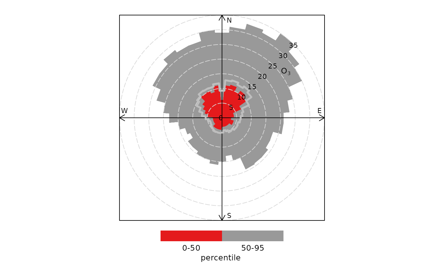
percentileRose(mydata, pollutant = "o3", percentile = c(50, 95), col = "brewer1")
# 50/95th percentiles of ozone, with different colours
percentileRose(mydata, pollutant = "o3", percentile = c(50, 95), col = "brewer1")
 if (FALSE) { # \dontrun{
# percentiles of ozone by year, with different colours
percentileRose(
mydata,
type = "year",
pollutant = "o3",
col = "brewer1",
ncol = 4,
nrow = 2
)
# percentile concentrations by season and day/nighttime..
percentileRose(
mydata,
type = c("daylight", "season"),
pollutant = "o3",
col = "brewer1"
)
} # }
if (FALSE) { # \dontrun{
# percentiles of ozone by year, with different colours
percentileRose(
mydata,
type = "year",
pollutant = "o3",
col = "brewer1",
ncol = 4,
nrow = 2
)
# percentile concentrations by season and day/nighttime..
percentileRose(
mydata,
type = c("daylight", "season"),
pollutant = "o3",
col = "brewer1"
)
} # }