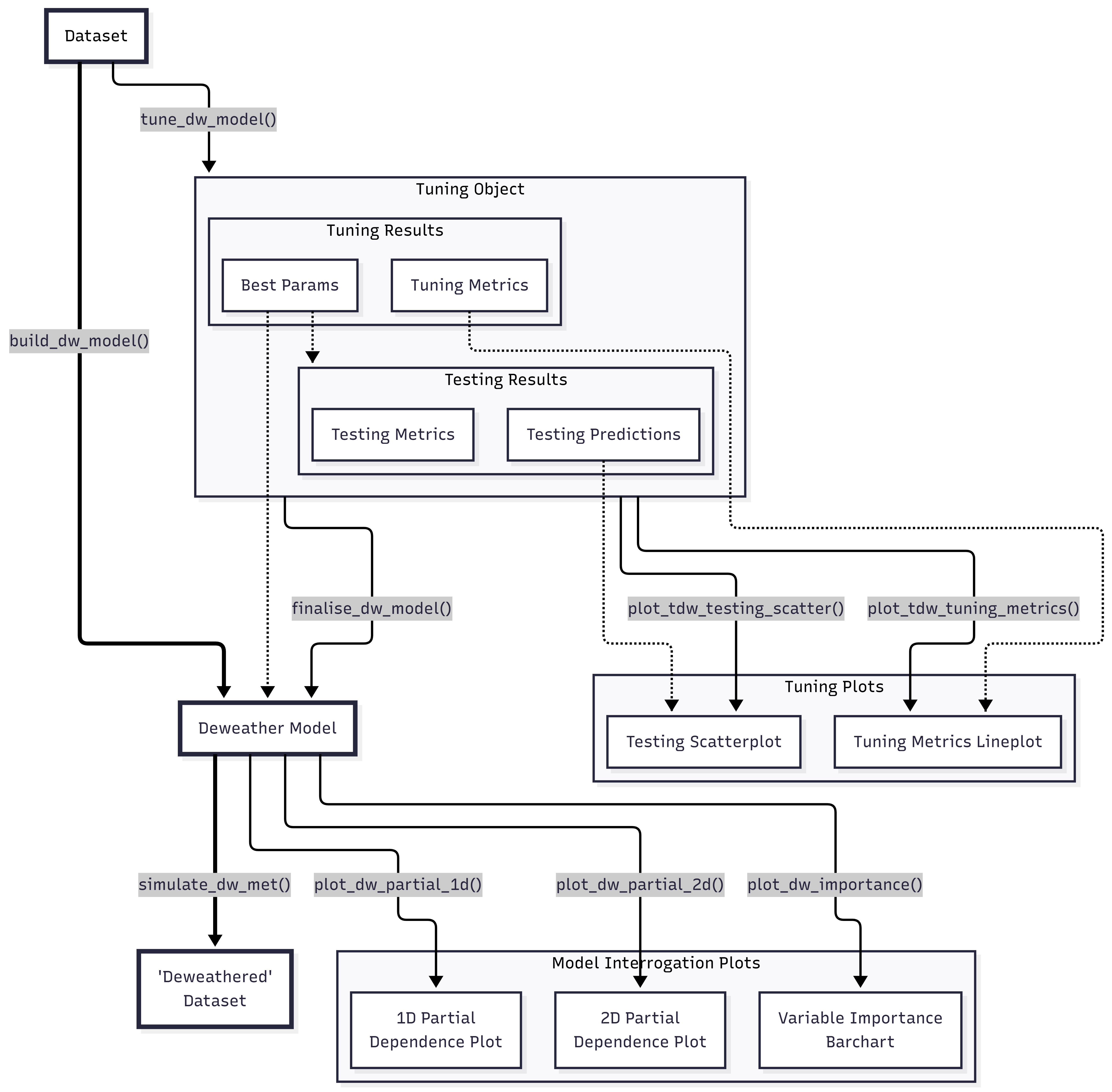
Meteorological Normalisation with {deweather}
Source:vignettes/articles/deweather.Rmd
deweather.RmdIntroduction
Meteorology plays a central role in affecting the concentrations of pollutants in the atmosphere. When considering trends in air pollutants it can be very difficult to know whether a change in concentration is due to emissions or meteorology.
By default, the deweather package uses a powerful statistical technique based on boosted regression trees using a variety of packages using the tidymodels framework. This allows for a variety of engines to be employed, with the default being xgboost. Statistical models are developed to explain concentrations using meteorological and other variables. These models can be tested on randomly withheld data with the aim of developing the most appropriate model.
Much of deweather supports parallel processing with the mirai package, so along with loading the library we’ll set some daemons as well as a seed.
Example data set
The deweather package comes with a comprehensive
data set of air quality and meteorological data. The air quality data is
from Marylebone Road in central London (obtained from the
openair package) and the meteorological data from
Heathrow Airport (obtained from the worldmet package).
The aqroadside data frame contains various pollutants such
a NOx, NO2, ethane and isoprene as well as
meteorological data including wind speed, wind direction, relative
humidity, ambient temperature and cloud cover.
head(aqroadside)
#> # A tibble: 6 × 11
#>   date                  nox   no2 ethane isoprene benzene    ws    wd air_temp
#>   <dttm>              <dbl> <dbl>  <dbl>    <dbl>   <dbl> <dbl> <dbl>    <dbl>
#> 1 2000-01-01 00:00:00   388    78   13.5     1.22    7.74  2.1    200     7.4
#> 2 2000-01-01 01:00:00   886    84   12.0     0.85    5.66  2.1    190     7.83
#> 3 2000-01-01 02:00:00   816   117   14.7     1.75   11.4   1.8    215     7.95
#> 4 2000-01-01 03:00:00   636    97   20.4     4.36   30.8   1.25   240     8.05
#> 5 2000-01-01 04:00:00   483    74   18.8     3.08   19.7   1.55   260     8.6
#> 6 2000-01-01 05:00:00   231    65   16.4     2.12   13.1   2.35   270     8.35
#> # ℹ 2 more variables: rh <dbl>, cl <dbl>
Prepare for Model Building
A straightforward way to get started is to use the
append_dw_vars() function to attach a load of useful model
features to your air quality data.frame. Variables such as
the hour of the day ("hour") and day of the week
("weekday") are used as features to explain some of the
variation. "hour" for example very usefully acts as a proxy
for the diurnal variation in emissions. These temporal emission proxies
are also important to include to help the model differentiate between
emission versus weather-related changes. For example, emissions tend to
change throughout a day and so do variables such as wind speed and
ambient temperature (here already present in the data as
"ws" and "air_temp" respectively).
Note that, strictly, append_dw_vars() does not need to
be run directly; if build_dw_model() or
tune_dw_model() are passed any of "hour",
"weekday", "trend", "yday",
"week", or "month" to vars, the
parent function will use append_dw_vars() itself in the
background if those columns do not exist in the input dataframe.
append_dw_vars(aqroadside) |>
  dplyr::glimpse()
#> Rows: 149,040
#> Columns: 18
#> $ date     <dttm> 2000-01-01 00:00:00, 2000-01-01 01:00:00, 2000-01-01 02:00:0…
#> $ nox      <dbl> 388, 886, 816, 636, 483, 231, 380, 287, 187, 111, 149, 132, 3…
#> $ no2      <dbl> 78, 84, 117, 97, 74, 65, 67, 69, 67, 57, 57, 57, 82, 84, 76, …
#> $ ethane   <dbl> 13.54, 11.99, 14.69, 20.38, 18.75, 16.38, 16.16, NA, NA, NA, …
#> $ isoprene <dbl> 1.22, 0.85, 1.75, 4.36, 3.08, 2.12, 1.25, NA, NA, NA, NA, 0.4…
#> $ benzene  <dbl> 7.74, 5.66, 11.38, 30.75, 19.66, 13.13, 7.64, NA, NA, NA, NA,…
#> $ ws       <dbl> 2.10, 2.10, 1.80, 1.25, 1.55, 2.35, 1.80, 1.00, 0.50, 0.00, 0…
#> $ wd       <dbl> 200, 190, 215, 240, 260, 270, 260, 250, 240, NA, 210, 275, 26…
#> $ air_temp <dbl> 7.400000, 7.833333, 7.950000, 8.050000, 8.600000, 8.350000, 8…
#> $ rh       <dbl> 97.33482, 97.15970, 99.00136, 98.67437, 95.11393, 97.71058, 9…
#> $ cl       <dbl> 5.0, 6.0, 4.5, 4.5, 7.5, 5.5, 8.0, 4.0, 1.5, 2.5, 4.0, 7.0, 4…
#> $ trend    <dbl> 946684800, 946688400, 946692000, 946695600, 946699200, 946702…
#> $ hour     <int> 0, 1, 2, 3, 4, 5, 6, 7, 8, 9, 10, 11, 12, 13, 14, 15, 16, 17,…
#> $ weekday  <fct> Sat, Sat, Sat, Sat, Sat, Sat, Sat, Sat, Sat, Sat, Sat, Sat, S…
#> $ weekend  <fct> weekend, weekend, weekend, weekend, weekend, weekend, weekend…
#> $ yday     <int> 1, 1, 1, 1, 1, 1, 1, 1, 1, 1, 1, 1, 1, 1, 1, 1, 1, 1, 1, 1, 1…
#> $ week     <int> 1, 1, 1, 1, 1, 1, 1, 1, 1, 1, 1, 1, 1, 1, 1, 1, 1, 1, 1, 1, 1…
#> $ month    <fct> Jan, Jan, Jan, Jan, Jan, Jan, Jan, Jan, Jan, Jan, Jan, Jan, J…
Build a Model
Tuning a Model
There are many input parameters to build_dw_model() and,
while sensible defaults have been set, you may be interested in seeing
how tweaking them can influence how well the model behaves. This is
called “tuning”, and the tune_dw_model() function provides
an interface for this. The right strategy differs between the boosted
tree engines (XGBoost, LightGBM) and the random forest engine
(ranger).
Note that this process can take a while, especially if many
parameters are being tuned. One way to speed this up is to invoke
parallel processing through the mirai package — see https://tune.tidymodels.org/articles/extras/optimizations.html#parallel-processing
for more information. In this example, we’ll also significantly trim
down the data to speed things up.
XGBoost and LightGBM
A practical strategy for boosted tree models is to
fix complexity controls (trees,
learn_rate, lambda, sample_size)
at conservative values and tune the structural
parameters (tree_depth, loss_reduction) over a
narrow range. This avoids the common pitfall of producing unnecessarily
large models: leaving trees free to be tuned almost always
results in the maximum value being selected, since adding more boosting
rounds will marginally reduce cross-validation RMSE even when the
practical benefit is negligible.
tuned_results <-
  aqroadside |>
  # want to sample by weekday to get good spread of categorical data
  append_dw_vars("weekday") |>
  dplyr::slice_sample(n = 250, by = weekday) |>
  # tune model
  tune_dw_model(
    pollutant = "no2",
    trees = 200L,
    tree_depth = c(2, 5),
    loss_reduction = c(0, 1),
    lambda = 2,
    sample_size = 0.8,
    grid_levels = 3L
  )
By default, tune_dw_model() uses
selection_method = "pct_loss", which selects the
simplest configuration (shallowest trees, strongest
regularisation) whose RMSE is within pct_loss_limit = 2
percent of the minimum. This avoids the well-known bias of strict
minimum-RMSE selection toward ever-larger tree counts. The best values
found here are tree_depth = 3 and
loss_reduction = 10.
get_tdw_best_params(tuned_results)
#> $tree_depth
#> [1] 3
#>
#> $loss_reduction
#> [1] 10
#>
#> $trees
#> [1] 200
#>
#> $mtry
#> NULL
#>
#> $min_n
#> [1] 10
#>
#> $learn_rate
#> [1] 0.1
#>
#> $sample_size
#> [1] 0.8
#>
#> $stop_iter
#> [1] 45
#>
#> $alpha
#> [1] 0
#>
#> $lambda
#> [1] 2
Examining the full set of metrics, rather than only the single best
configuration, lets you assess the sensitivity of the model to each
hyperparameter and judge whether the 2% tolerance is appropriate for
your data. The get_tdw_tuning_results() function returns
the raw tune_grid() output, allowing you to apply your own
selection strategy — for example
tune::select_by_one_std_err() — if you prefer a different
approach.
get_tdw_tuning_metrics(tuned_results)
#> # A tibble: 18 × 6
#>    tree_depth loss_reduction metric   mean     n std_err
#>         <int>          <dbl> <chr>   <dbl> <int>   <dbl>
#>  1          2           1    rmse   31.0      10  0.621
#>  2          2           1    rsq     0.589    10  0.0197
#>  3          2           3.16 rmse   31.0      10  0.621
#>  4          2           3.16 rsq     0.589    10  0.0197
#>  5          2          10    rmse   31.0      10  0.621
#>  6          2          10    rsq     0.589    10  0.0197
#>  7          3           1    rmse   29.7      10  0.642
#>  8          3           1    rsq     0.624    10  0.0193
#>  9          3           3.16 rmse   29.7      10  0.642
#> 10          3           3.16 rsq     0.624    10  0.0193
#> 11          3          10    rmse   29.7      10  0.642
#> 12          3          10    rsq     0.624    10  0.0192
#> 13          5           1    rmse   29.7      10  0.653
#> 14          5           1    rsq     0.626    10  0.0196
#> 15          5           3.16 rmse   29.6      10  0.675
#> 16          5           3.16 rsq     0.629    10  0.0187
#> 17          5          10    rmse   29.5      10  0.675
#> 18          5          10    rsq     0.631    10  0.0187
It can be useful to see this data in a plot; the
plot_tdw_tuning_metrics() function allows for this to be
done fairly flexibly. Note that this function is likely of most use with
between 1 and 3 tuned hyperparameters; any more and it is likely to be
too messy to be interpretable. It may be useful to look for the ‘elbow’
in the data, where the decrease in RMSE or increase in RSQ goes from a
steep gradient to a shallow one — around this point, additional model
complexity provides diminishing returns. For tree_depth in
particular, the elbow often appears between depths 2 and 4 for typical
hourly air quality data; beyond this, RMSE reductions are marginal and
partial dependencies become harder to interpret.
plot_tdw_tuning_metrics(tuned_results, x = "tree_depth", group = "loss_reduction")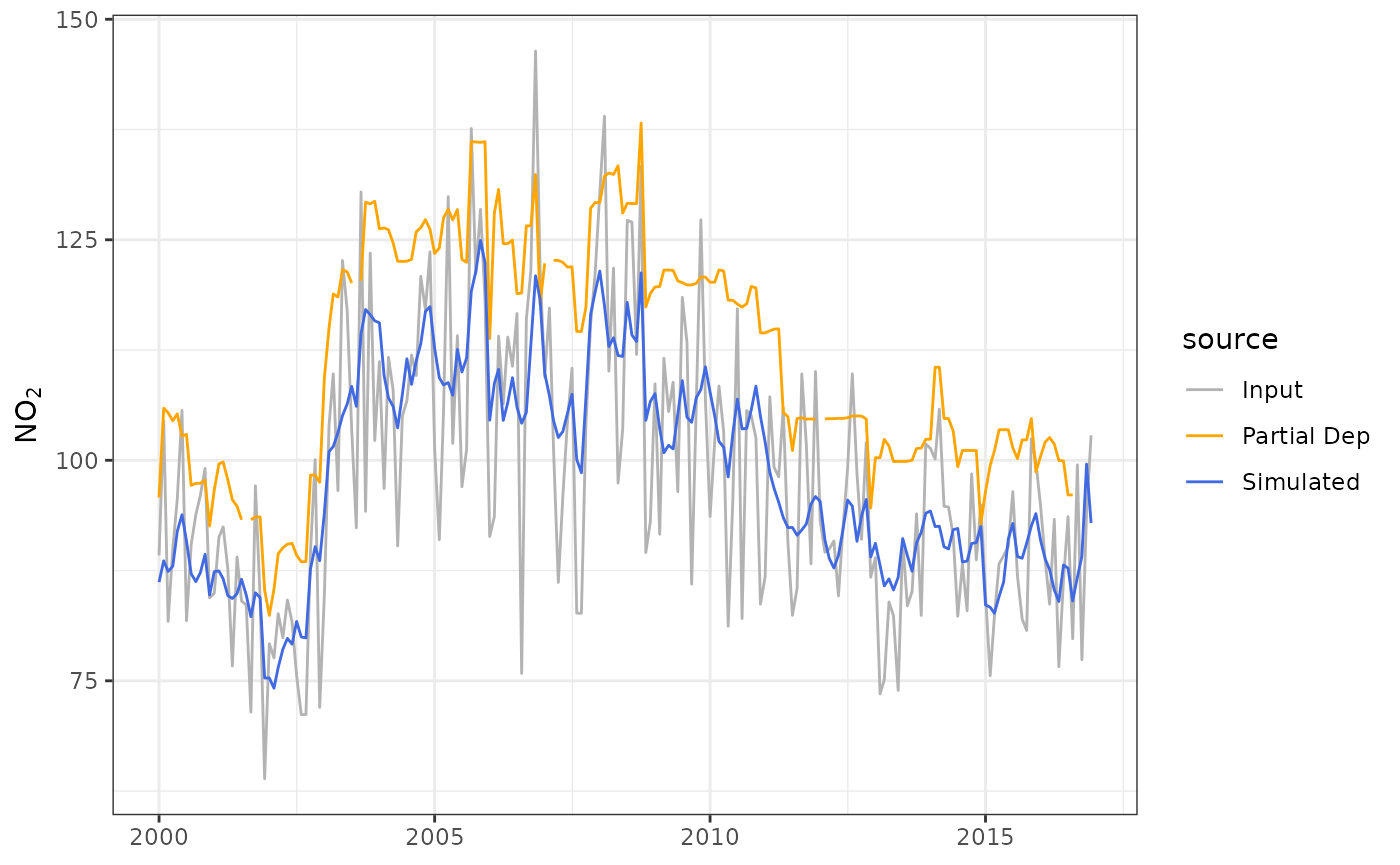
We can also see how the tuned model behaved on some reserved testing data, using the ‘best parameters’ it has decided on. A set of predictions is included (which can be usefully plotted as a scatter chart or binned surface), as well as a set of metrics to evaluate.
get_tdw_testing_metrics(tuned_results) |>
  dplyr::glimpse()
#> List of 11
#>  $ n   : int 424
#>  $ fac2: num 0.953
#>  $ mb  : num -1.47
#>  $ mge : num 20.4
#>  $ nmb : num -0.0155
#>  $ nmge: num 0.214
#>  $ rmse: num 27.8
#>  $ r   : num 0.813
#>  $ p   : num 2.7e-101
#>  $ coe : num 0.461
#>  $ ioa : num 0.73
plot_tdw_testing_scatter(tuned_results)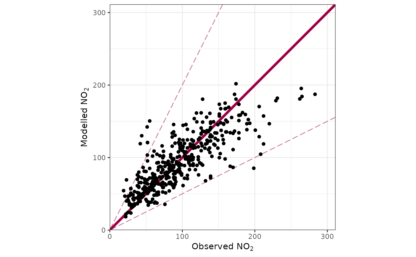
Ranger (Random Forest)
Random forests are considerably less sensitive to hyperparameter choice than gradient-boosted trees — ranger’s built-in defaults work well for most hourly air quality datasets, so formal tuning is often optional. When it is worth doing, two parameters drive most of the benefit:
-
mtry: the number of predictors considered at each split. This is the most influential parameter. Ranger defaults tofloor(p/3)for regression (2 for a 6-predictor model), and testing a range from 2 topcovers all reasonable values. -
min_n: minimum observations per leaf. Higher values produce shallower trees and smoother partial dependencies.
trees should be fixed rather than
tuned. Each tree in a random forest is an independent
estimator; more trees only reduces prediction variance and there is no
overfitting risk, so the question is not whether to have more
trees but simply how much compute time to spend. In practice, gains
beyond 50–100 trees tend to be marginal for typical hourly air quality
datasets — try 100 for your own data and compare against the default 50
to see whether there is a meaningful improvement. Tuning
trees tends to select the minimum value within the
tolerance band, which increases prediction variability
unnecessarily.
The ranger-specific engine parameters exposed by
tune_dw_model() (regularization.factor,
splitrule, alpha, minprop,
num.random.splits) address niche problems such as
high-dimensional variable selection or alternative split criteria, and
are not needed for standard air quality deweathering. The default split
rule ("variance") is the correct choice for regression.
Because the tree-count inflation problem is specific to sequential
boosting, selection_method = "best" is more appropriate for
ranger than the default "pct_loss".
tuned_results_rf <-
  aqroadside |>
  append_dw_vars("weekday") |>
  dplyr::slice_sample(n = 250, by = weekday) |>
  tune_dw_model(
    pollutant = "no2",
    engine = "ranger",
    trees = 50L,            # fix rather than tune; try 100 if compute allows
    mtry = c(2, 6),         # key parameter: range from 2 to number of predictors
    min_n = c(5, 20),       # secondary: controls tree depth and smoothness
    grid_levels = 3L,
    selection_method = "best"
  )
Finalising a Model
Assuming that a good model can be developed, it can now be explored
in more detail. deweather has useful defaults for many of
the model parameters, but these can be adjusted by the user if
required.
no2_model <-
  build_dw_model(
    data = aqroadside,
    pollutant = "no2",
    vars = c("trend", "ws", "wd", "hour", "weekday", "air_temp"),
    engine = "xgboost"
  )
Alternatively, if you have carried out some model tuning, you can use
the finalise_tdw_model() function to automatically lift the
‘best’ parameters from that.
no2_model_alt <- finalise_tdw_model(tuned_results, aqroadside)

# The `params` argument overrides individual best parameters if desired,
# e.g. to accept a shallower tree depth than the one selected:
no2_model_alt <- finalise_tdw_model(tuned_results, aqroadside, params = list(tree_depth = 2))
Both of these functions return a “deweather model” object. We can see a quick summary of it by simply printing it.
no2_model
#>
#> ── Deweather Model ─────────────────────────────────────────────────────────────
#> A model for predicting no2 using wd (43.9%), hour (29.0%), trend (10.8%),
#> weekday (8.4%), ws (5.8%), and air_temp (2.0%).
#>
#> ── Model Parameters ──
#>
#> • tree_depth: 5
#> • trees: 50
#> • learn_rate: 0.1
#> • mtry: NULL
#> • min_n: 10
#> • loss_reduction: 0
#> • sample_size: 1
#> • stop_iter: 45
We can also pull out specific features of the model using
get_dw_*() functions. deweather has many of
such ‘getter’ functions, and they form a consistent, useful API for
accessing relevant features of different objects created in the
package.
get_dw_pollutant(no2_model)
#> [1] "no2"
get_dw_vars(no2_model)
#> [1] "trend"    "ws"       "wd"       "hour"     "weekday"  "air_temp"
get_dw_input_data(no2_model)
#> # A tibble: 144,535 × 7
#>      no2     trend    ws    wd  hour weekday air_temp
#>    <dbl>     <dbl> <dbl> <dbl> <int> <fct>      <dbl>
#>  1    78 946684800  2.1    200     0 Sat         7.4
#>  2    84 946688400  2.1    190     1 Sat         7.83
#>  3   117 946692000  1.8    215     2 Sat         7.95
#>  4    97 946695600  1.25   240     3 Sat         8.05
#>  5    74 946699200  1.55   260     4 Sat         8.6
#>  6    65 946702800  2.35   270     5 Sat         8.35
#>  7    67 946706400  1.8    260     6 Sat         8.2
#>  8    69 946710000  1      250     7 Sat         7.1
#>  9    67 946713600  0.5    240     8 Sat         6.2
#> 10    57 946720800  0.5    210    10 Sat         6.9
#> # ℹ 144,525 more rows
One feature we immediately have access to is the “feature importance”
score. This can be obtained as a data.frame using a similar
approach to the above. This varies depending on the chosen
engine, but for boosted trees this represents ‘Gain’ - the
fractional contribution of each feature to the model based on the total
gain of this feature’s splits. A higher percentage means a more
important predictive feature.
get_dw_importance(no2_model)
#> # A tibble: 12 × 2
#>    var        importance
#>    <fct>           <dbl>
#>  1 wd           0.439
#>  2 hour         0.290
#>  3 trend        0.108
#>  4 ws           0.0583
#>  5 weekdaySun   0.0479
#>  6 weekdaySat   0.0296
#>  7 air_temp     0.0196
#>  8 weekdayMon   0.00216
#>  9 weekdayThu   0.00166
#> 10 weekdayWed   0.00108
#> 11 weekdayTue   0.000806
#> 12 weekdayFri   0.000550
The Gain can be automatically plotted as a bar chart using the
plot_dw_importance() function. The wind direction is the
most predictive feature, and the day of the week being any week day is
the least predictive feature.
plot_dw_importance(no2_model)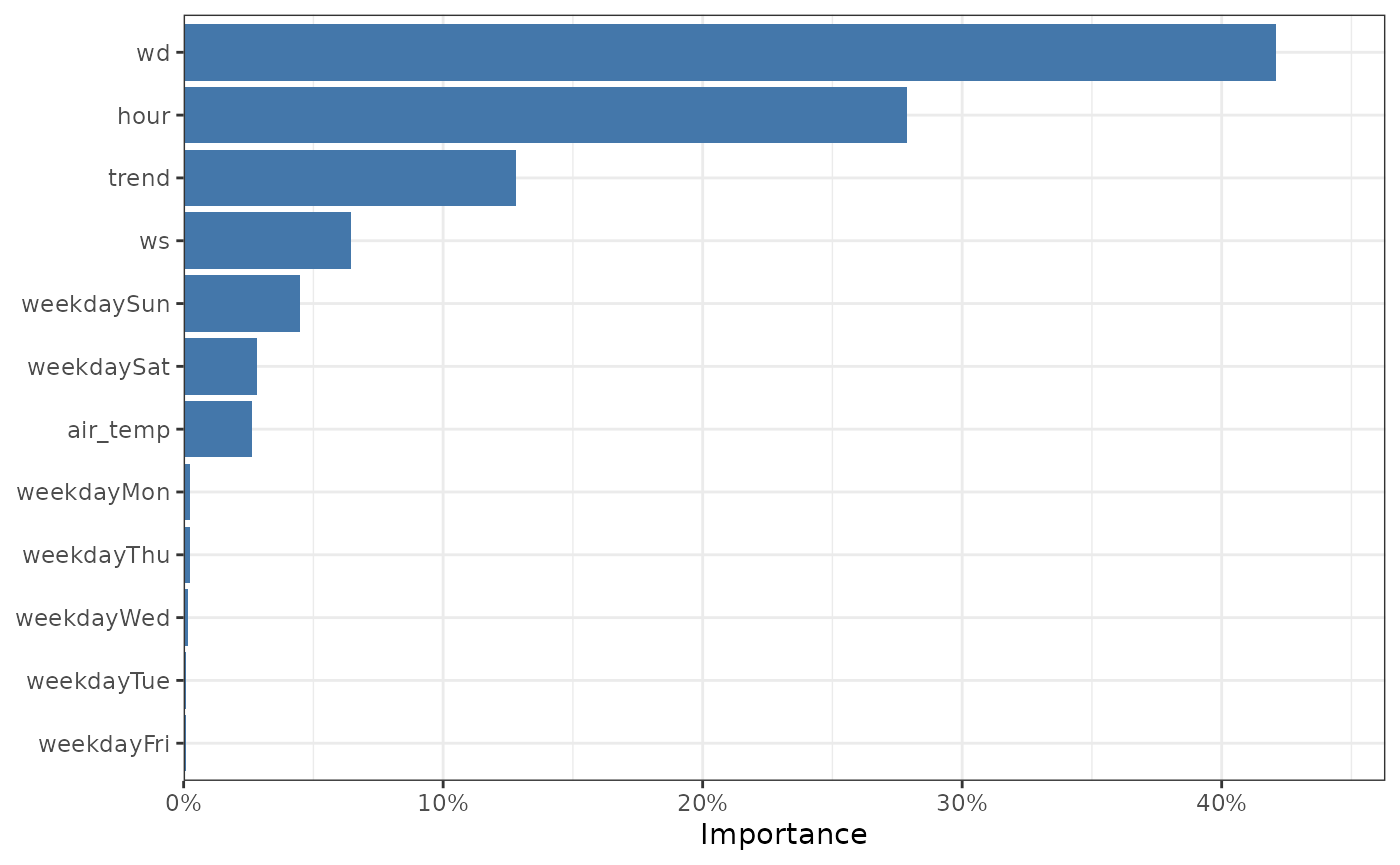
The feature importance of our model.
You’ll notice that our ‘character’ variable, the day of the week, has
been split out into multiple levels. This is because
xgboost requires numeric variables, so behind the scenes
our ‘day of the week’ variable is split out into a matrix of seven
variables. This is informative - for example, we can see here that the
day of the week being a weekend is a useful feature. Regardless, if you
would like to see factor features as single features, the
aggregate_factors argument may be of use.
plot_dw_importance(no2_model, aggregate_factors = TRUE)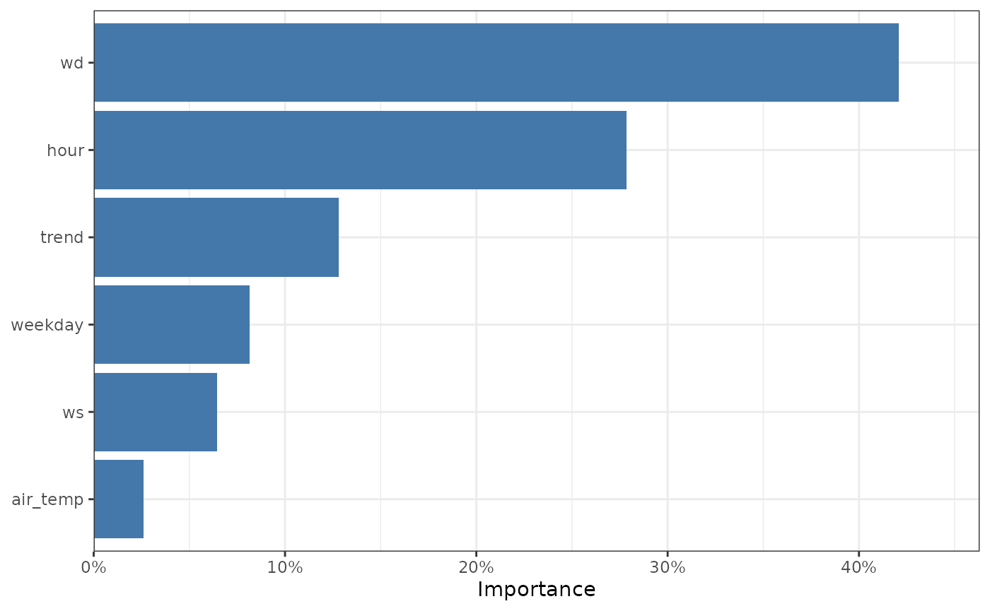
The feature importance of our model, with factors aggregated.
Examine the partial dependencies
Basic PD Plots
One of the benefits of the boosted regression tree approach is that the partial dependencies can be explored. In simple terms, the partial dependencies show the relationship between the pollutant of interest and the covariates used in the model while holding the value of other covariates at their mean level.
Lets plot a partial dependency for the hour variable.
We’ll set n to 100 for speed; this will sample
100 random samples of our original data to construct the plot. We can
see that no2 is highest during the day and lowest
overnight, everything else kept equal.
plot_dw_partial_1d(no2_model, "hour", n = 100)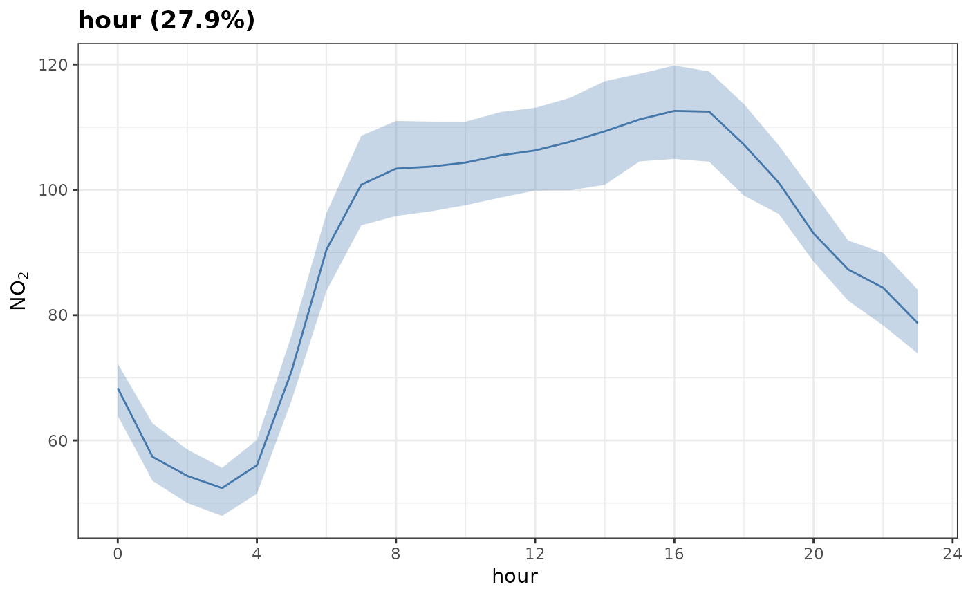
A categorical variable like weekday looks slightly
different, but achieves a similar result. no2 is lowest on
weekends, all else being equal.
plot_dw_partial_1d(no2_model, "weekday", n = 100)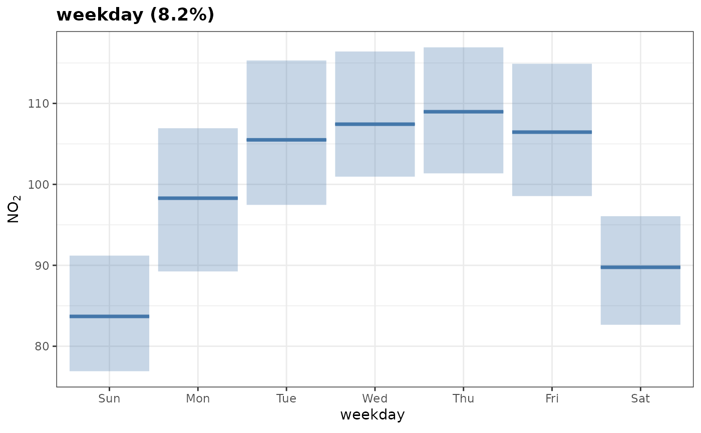
If a variable isn’t given, all variables will be plotted in a
patchwork assembly in order of importance.
plot_dw_partial_1d(no2_model, n = 100)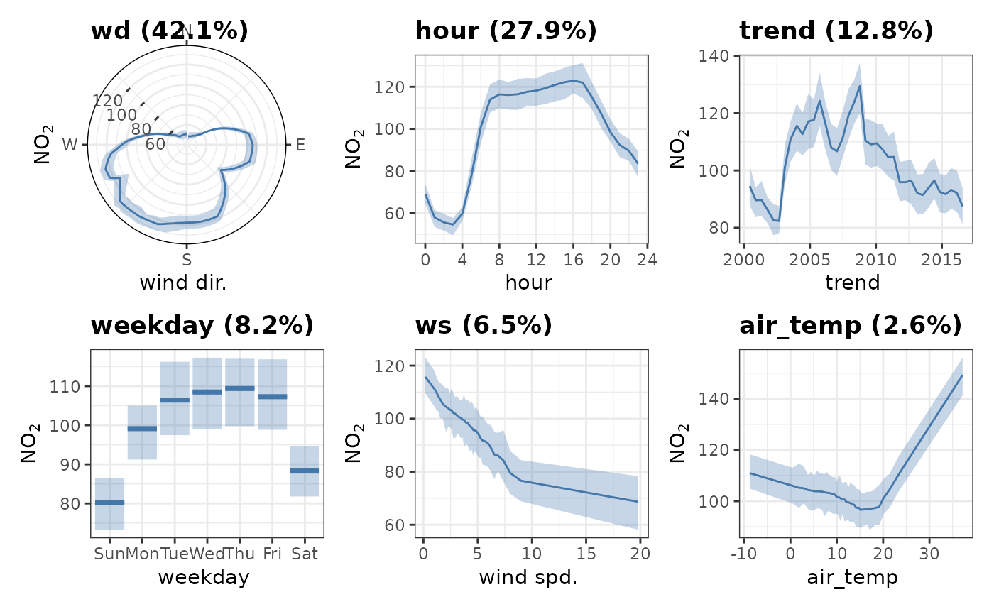
Grouped PD
Sometimes, when examining partial dependences, it is useful to consider grouped partial dependences. This means, before PDs are calculated, we split the data into groups and calculate PDs for each subset of the data. Let’s give this a go now.
plot_dw_partial_1d(no2_model, "hour", group = "weekday", n = 1000)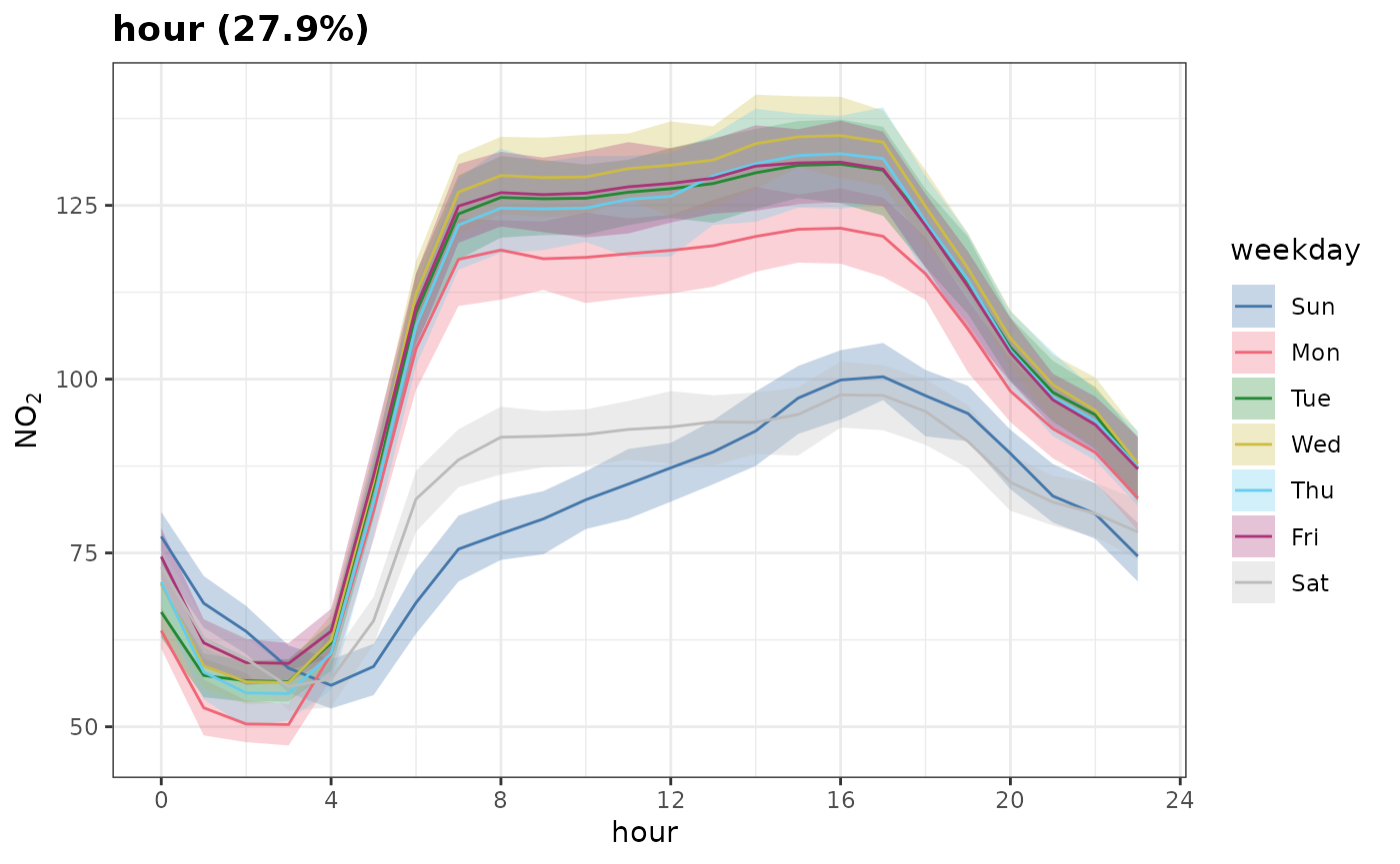
Note that group need not be categorical; you may provide
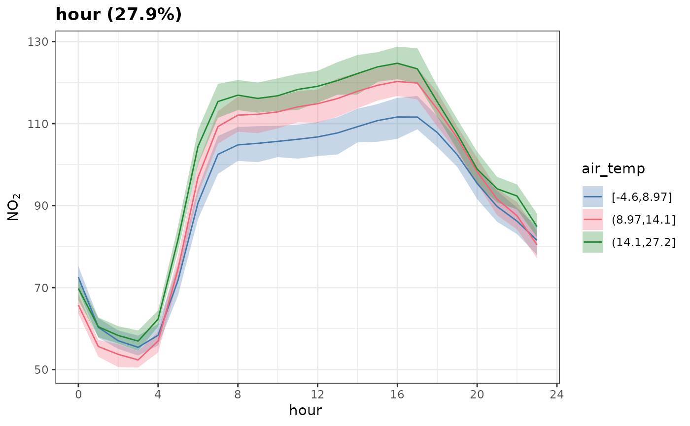
a continuous variable which will be binned into
group_intervals. Here we group by "air_temp"
and split it into 3 equally sized bins.
plot_dw_partial_1d(
  no2_model,
  "hour",
  group = "air_temp",
  group_intervals = 3L,
  n = 1000
)
Two-Way Interactions
Above we needed to treat one of our continuous features as a factor feature.
It can be very useful to plot important two-way interactions. In this
example the interaction between "ws" and
"air_temp" is considered. The plot shows that
no2 tends to be high when the wind speed is low and the
temperature is low, i.e., stable atmospheric conditions. Also
no2 tends to be high when the temperature is high, which is
most likely due to more O3 available to convert NO to
NO2. In fact, background O3 would probably be a
useful covariate to add to the model.
plot_dw_partial_2d(no2_model, "ws", "air_temp", n = 200)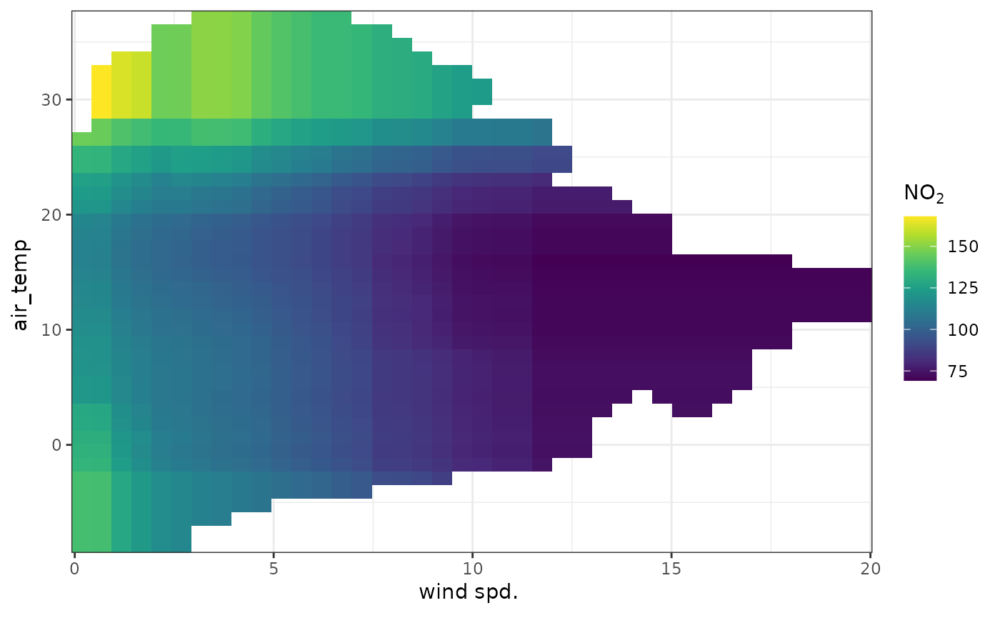
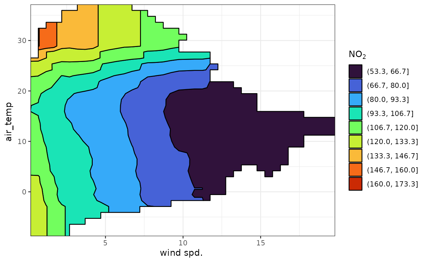
It can be easier to see some of these relationships using a binned
scale. contour = "lines" will overlay the continuous colour
surface with contour lines. contour = "fill" will bin the
entire colour scale. The number of bins is controlled using the
contour_bins argument.
plot_dw_partial_2d(
  no2_model,
  "ws",
  "air_temp",
  n = 200,
  contour = "fill",
  contour_bins = 10,
  cols = "turbo"
)
Customisation
These plots can be customised like any other ggplot2 object.
library(ggplot2)

plot_dw_partial_1d(no2_model, "hour", group = "weekday") +
  theme_light(14) +
  theme(
    title = element_text(face = "bold"),
    plot.subtitle = element_text(face = "plain", size = 11),
    legend.position = "none"
  ) +
  scale_fill_manual(
    values = c(
      "orange",
      "cadetblue",
      "lightblue4",
      "lightblue3",
      "lightblue2",
      "lightblue1",
      "orange3"
    ),
    aesthetics = c("fill", "color")
  ) +
  labs(
    x = "Hour of the Day",
    y = "NOx (ug/m3)",
    fill = "Weekday",
    color = "Weekday",
    subtitle = "Weekends (orange) have lower NOx emissions than weekdays (blue)."
  ) +
  scale_y_continuous(limits = c(0, NA)) +
  scale_x_continuous(breaks = seq(0, 24, 4), expand = expansion())
#> Scale for fill is already present.
#> Adding another scale for fill, which will replace the existing scale.
#> Scale for y is already present.
#> Adding another scale for y, which will replace the existing scale.
#> Scale for x is already present.
#> Adding another scale for x, which will replace the existing scale.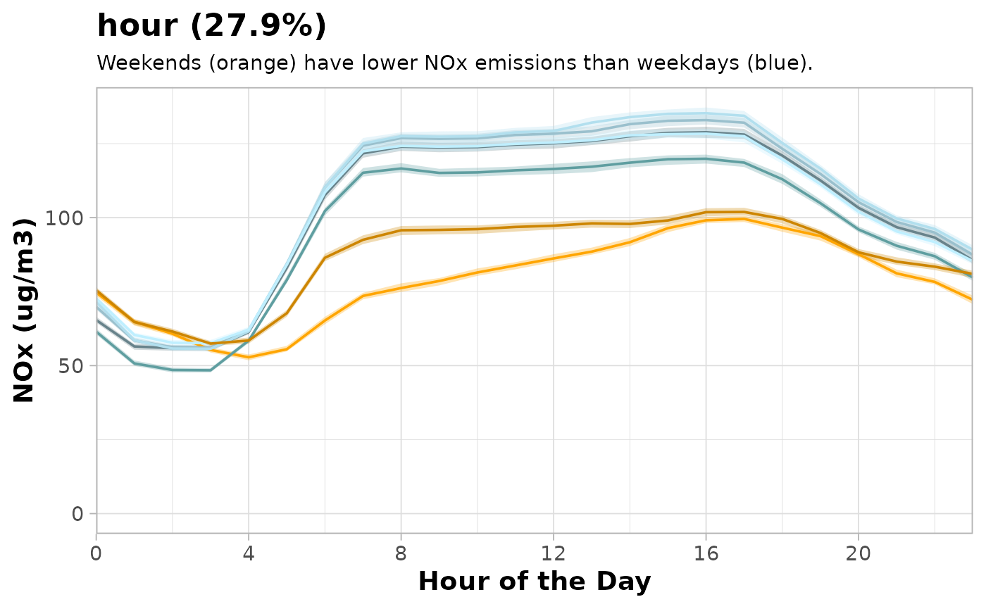
A thoroughly customised partial dependence plot.
Apply meteorological averaging
An indication of the meteorologically-averaged trend is
given by the plot_dw_partial_1d() function above.
plot_dw_partial_1d(no2_model, "trend", n = 100, intervals = 100)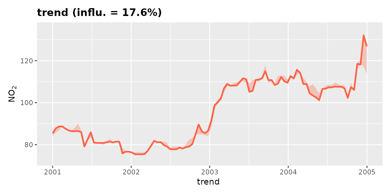
A much better indication is given by using the model to predict many
times with random sampling of meteorological
conditions. This sampling is carried out by the
simulate_dw_met() function.
Note that you’d typically want n to be a higher value
for publication-quality results; 200–500 is common. It has been set to
50 here purely to keep this example brief. Constrained
meteorological sampling is pre-computed across all n
simulations in a single pass, so increasing n adds only the
cost of additional predictions rather than repeated sampling work.
Recall also that mirai::daemons() are set to distribute
those predictions across parallel workers.
demet <- simulate_dw_met(
  no2_model,
  vars = c("ws", "wd", "air_temp"),
  n = 50
)
Now it is possible to plot the resulting trend. The
plot_sim_trend() function is a convenient way to do so.
plot_sim_trend(demet)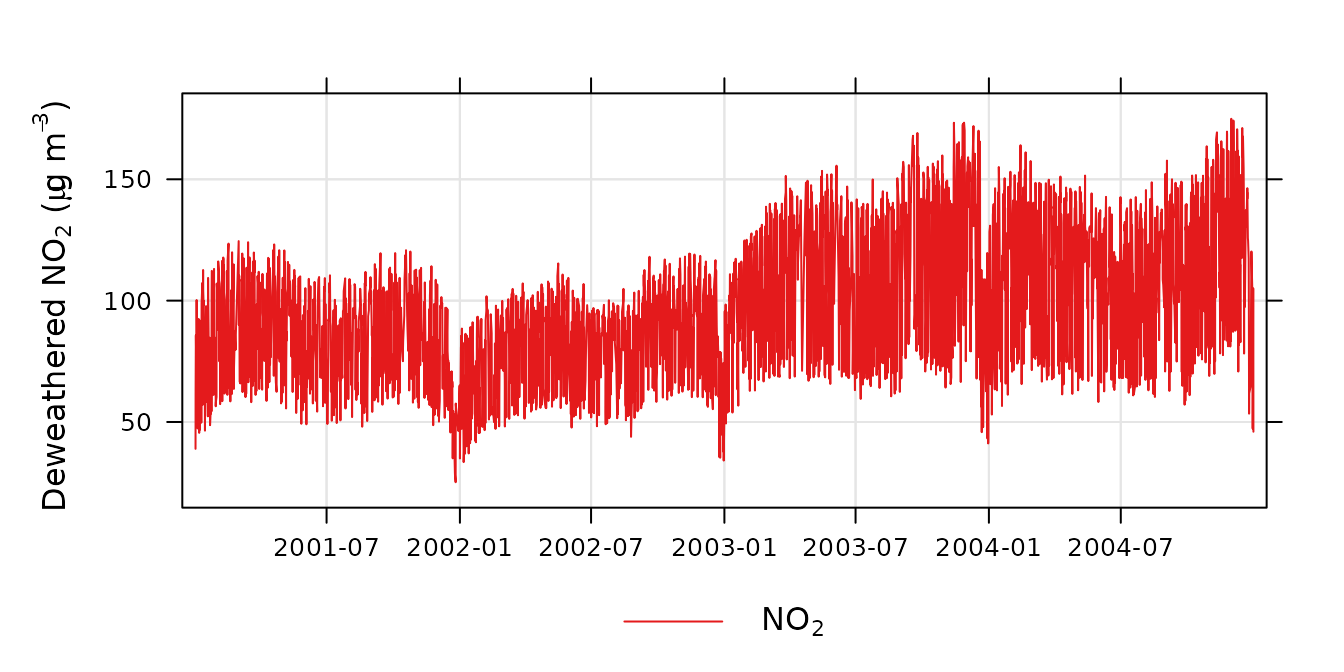
A deweathered nitrogen dioxide trend.
The plot shows the trend in NO2 controlling for the main weather variables. The plot now reveals the strong diurnal and weekly cycle in NO2 that is driven by variations in the sources of NO2 (NOx) rather than meteorology, i.e., road traffic which has strong hourly and daily variations throughout the year. It can be useful to simply average the results to provide a better indication of the overall trend. For example:
plot_sim_trend(demet, avg.time = "month")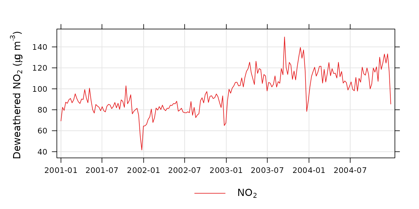
A time-averaged deweathered nitrogen dioxide trend.
It can be useful to compare this simulated trend to the original
input data. plot_sim_trend() can be provided the model used
to construct demet to overlay both on the same plot. Also
useful to highlight is the .plot_engine argument, which
supports "ggplot2" for static plots and
"plotly" for interactive plots;
plot_sim_trend() using the plotly engine
provides useful tooltips, zooming, and the ability to toggle the
different traces on and off.
plot_sim_trend(
  demet,
  dw = no2_model,
  avg.time = "week",
  .plot_engine = "plotly"
)
Note that the function predict_dw() is also provided for
generalised use of a deweather model for prediction.